In 2013, a team within Intel’s R&D division called the “Perceptual Computing Group” approached Fresh Tilled Soil with a curious bit of technology: a depth-sensing camera that could recognize objects in 3D space. Paired with the right software, this would enable computers to understand human hand gestures.
The prototype was a large, USB-connected peripheral, but the team felt that with proper investment, they could miniaturize the technology and license it to OEMs. In a few years, every laptop, phone, and tablet could have a built-in 3D camera from Intel.
To secure further funding, they needed buy-in from Intel executives. The perceptual computing group asked Fresh Tilled Soil to design and develop a fully-functioning prototype application, a demo that would highlight the technology’s extraordinary potential. Thus began one of the strangest and most rewarding projects of my career.

Diving in
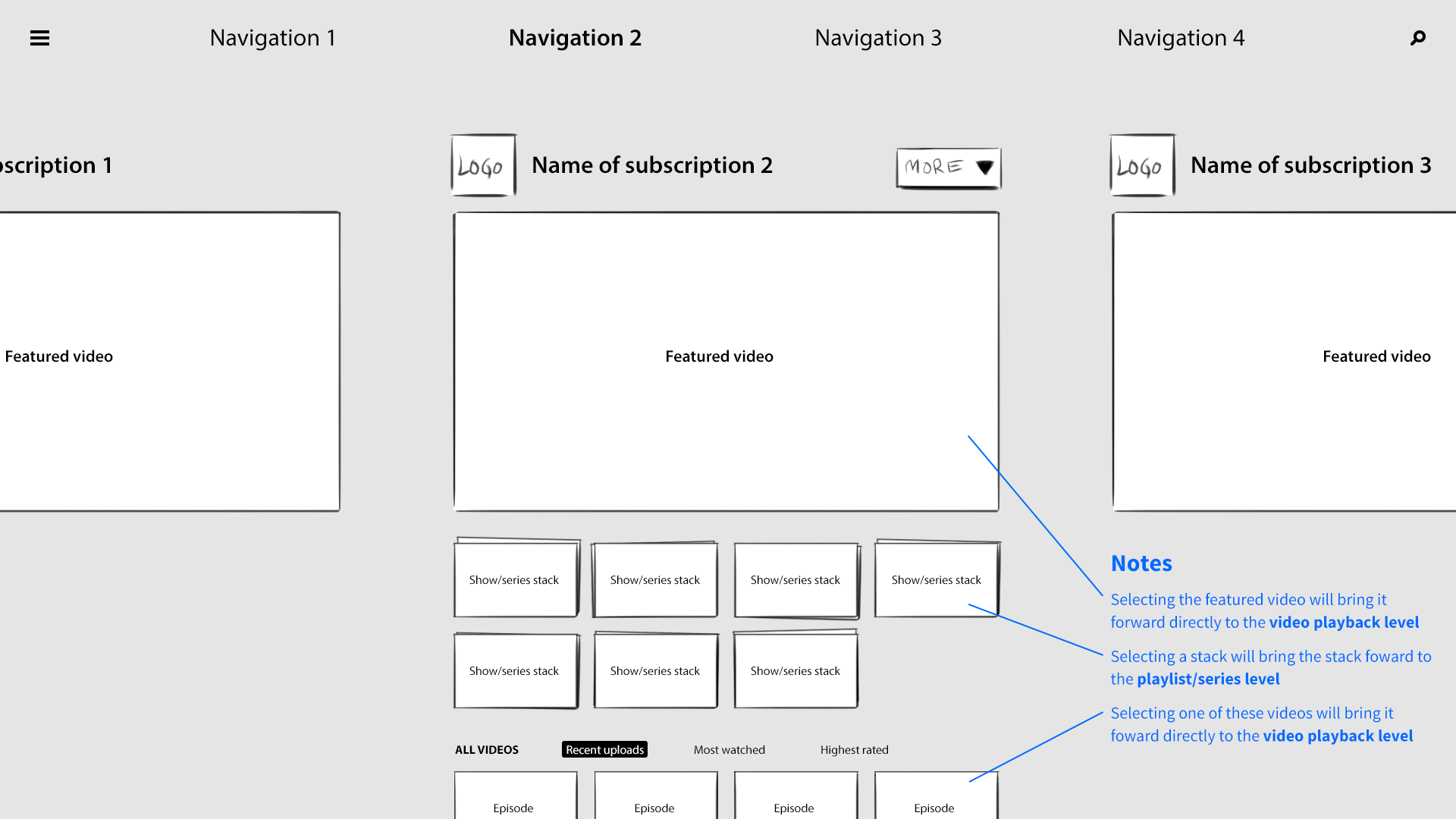
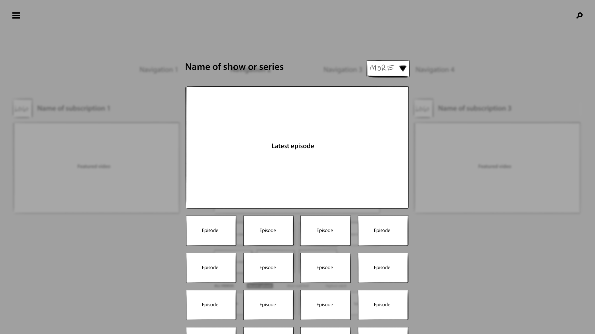
Our clients believed that the best approach would be a fusion of future and present, a familiar task presented in a novel manner. They settled on a YouTube client: a web app for searching, browsing, and watching videos, driven by hand gestures and presented in an immersive 3D interface.
My teammates at Fresh Tilled Soil were designers Alex Sylvia and Steve Benoit, as well as software engineer Paul Greenlea, who had a particular knack for developing wild and experimental web applications that pushed the boundaries of the browser. Though I made contributions to visual design and aesthetic, my primary focus was the fundamental interaction model. After all, this was brand new territory. We had a lot of questions to answer.
Mapping 3D Space
Intel’s team felt that a 3D UI would highlight the technology’s ability to interpret 3D space, but I was wary. At the time, film studios and TV manufacturers were pushing 3D hard, and it all felt super gimmicky. I pictured stock photos of gasping, begoggled moviegoers, recoiling in surprise as a laser-blasting shark burst forth from their television set.
I was determined to guard against whiz bang effects that would quickly wear out their welcome, and to ensure that our 3D interface would be grounded in reason and sound user experience principles.
I proposed a spacial interface grounded in clear and consistent rules. Depth and animation would communicate location and context, and simply exploring the app would reinforce the user’s understanding of the system.
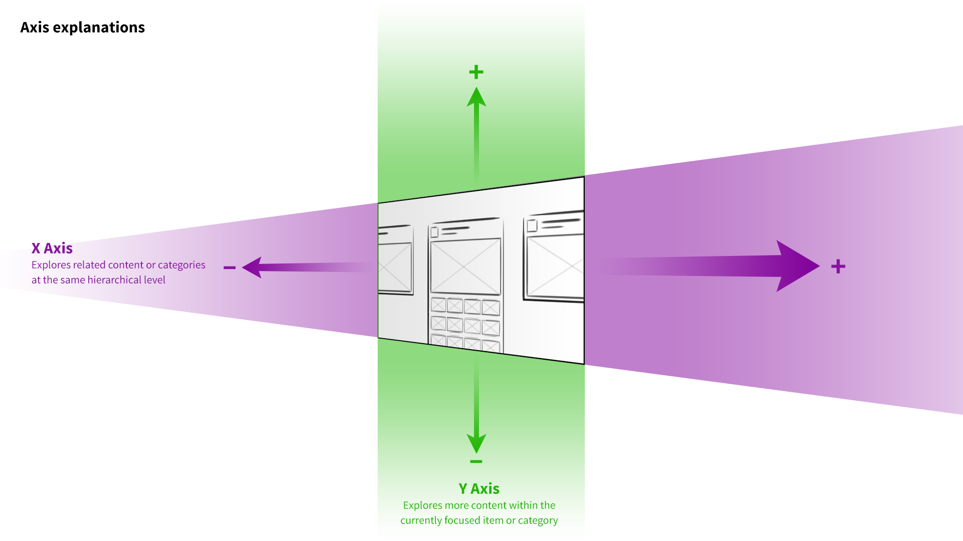
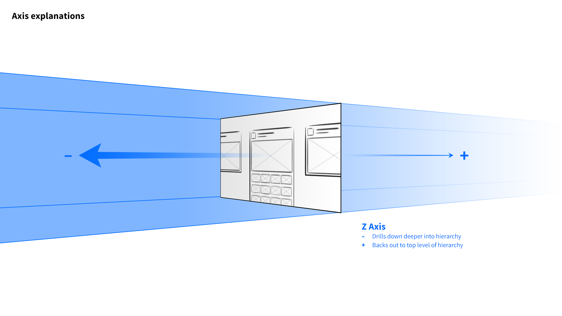
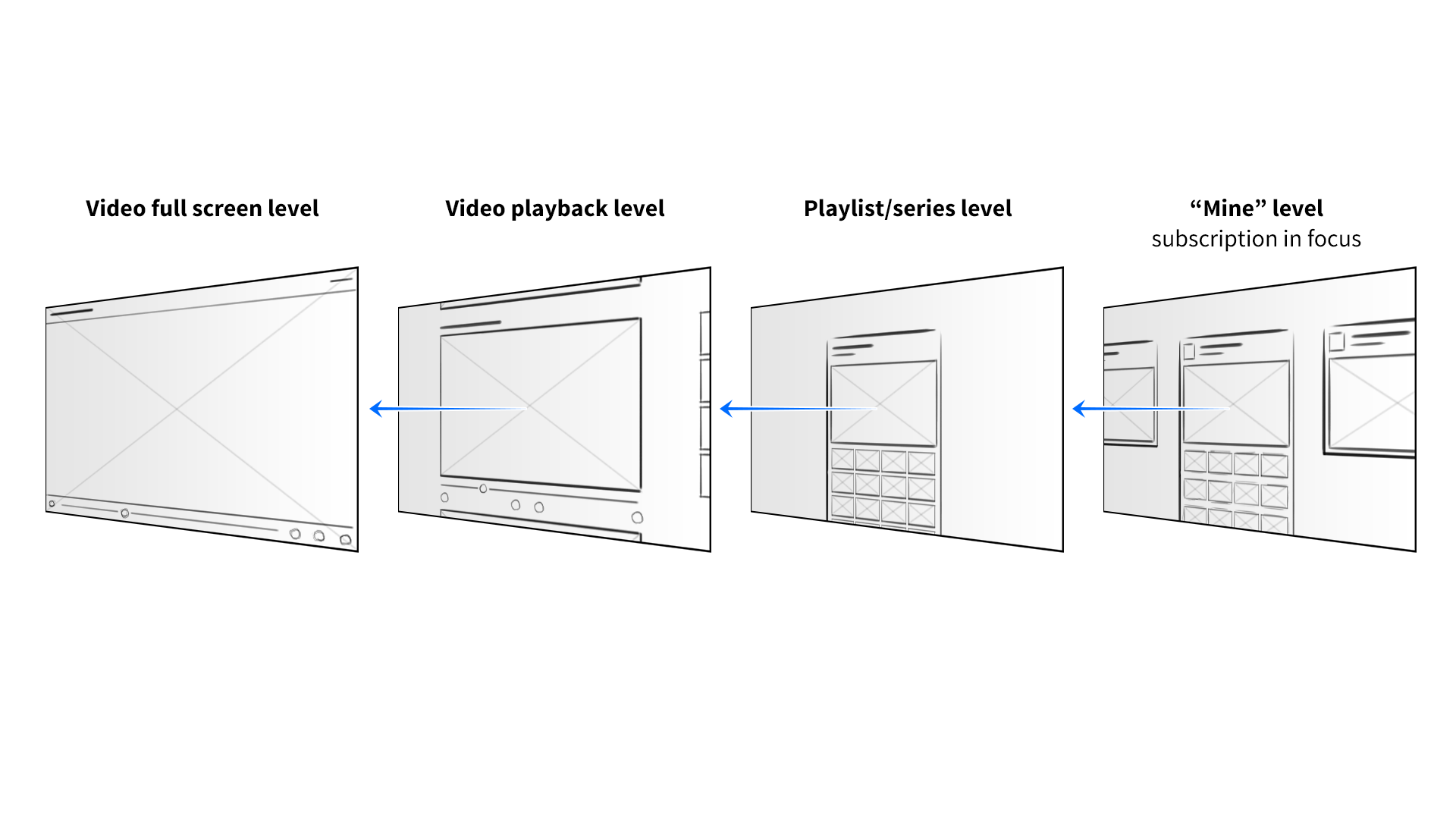
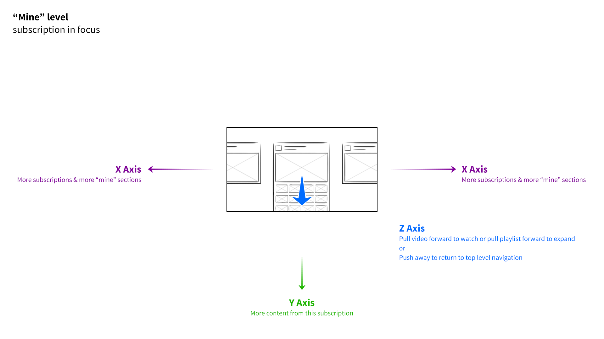
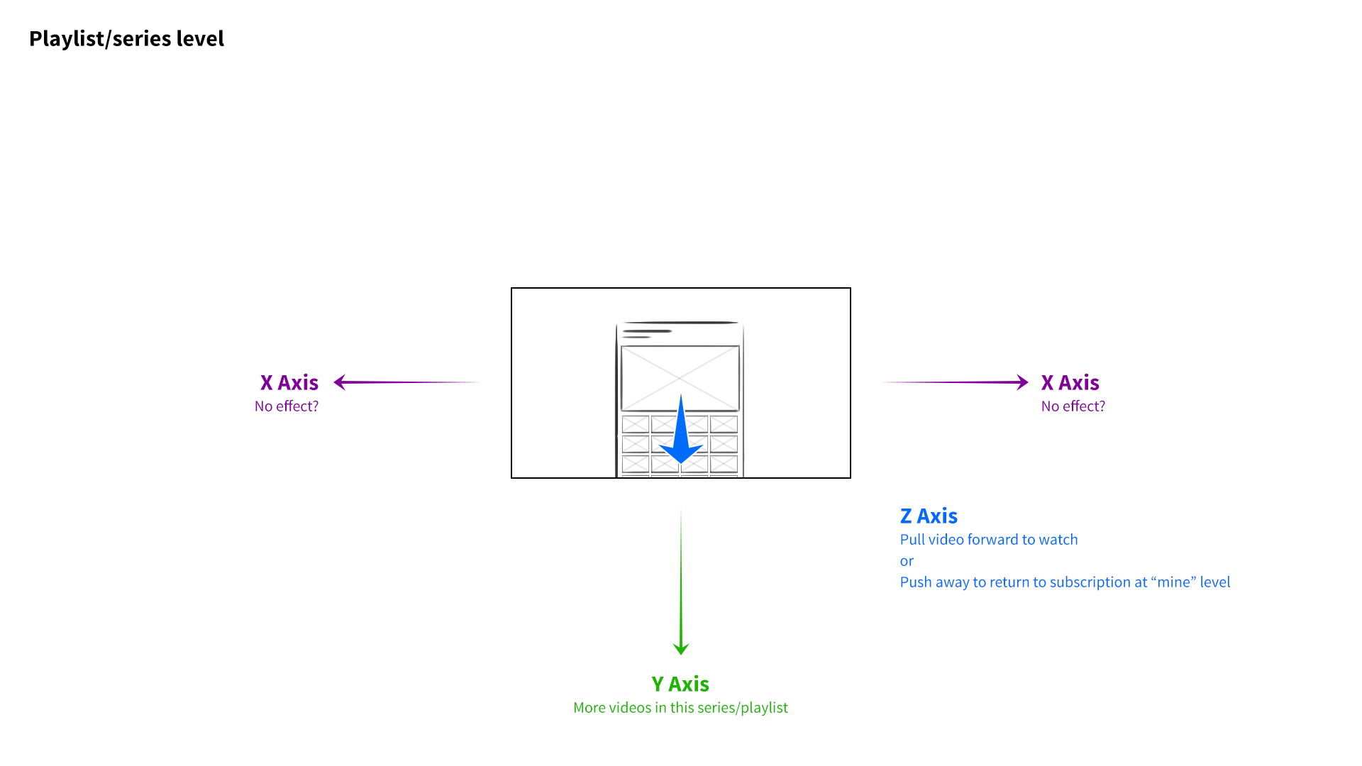
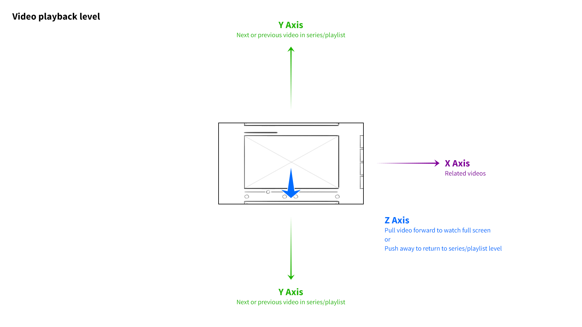
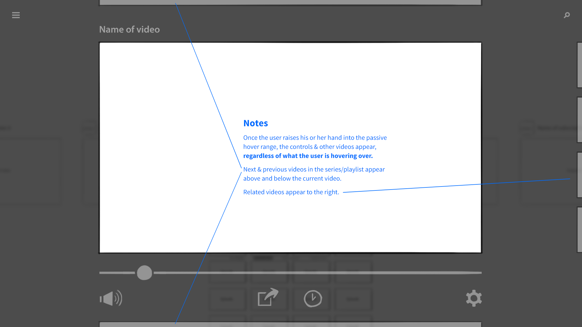
I developed a 3-axis model. At the base level of the interface, the user’s favorite channels would be presented as columns of videos sitting side by side. Scrolling left to right would navigate between channels, and scrolling up and down on a given column would explore that channel’s featured content. The z-axis would represent the next level of hierarchy—when a user “clicked” a whole channel, for example, it would be pulled forward, elevated over the previous level.
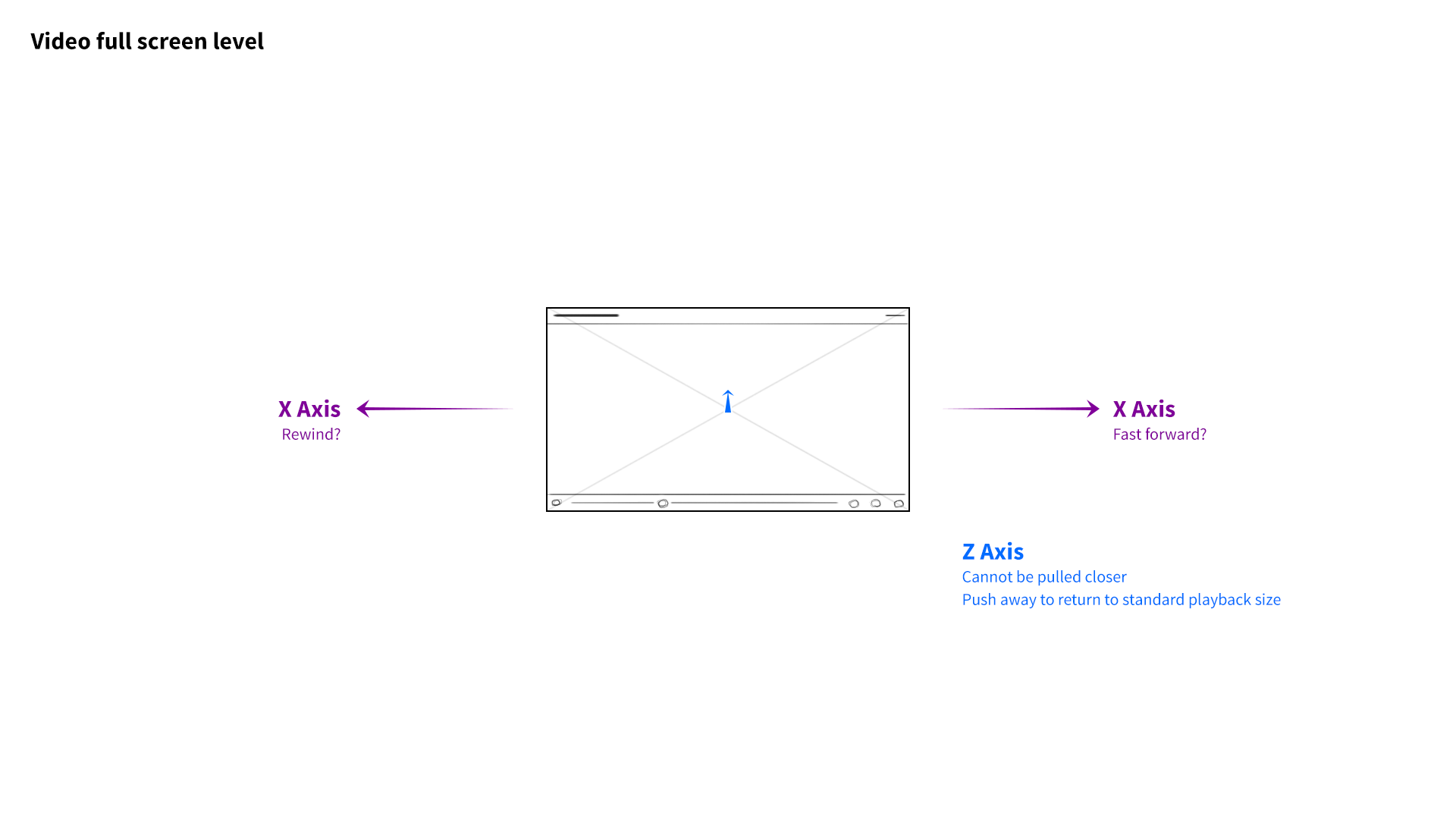
If the channel they selected had multiple playlists, those collections would be arranged as columns of videos along the X axis, just as entire channels had before. The user could swipe to the left, stop at a specific playlist, and scroll down to find a video. Selecting the video would pop it forward on the z-axis, and pulling it forward further would expand it to full screen. Pushing content away would do the reverse, enabling the user to “back out.” It was a consistent and intuitive navigational system, through and through.
Creating a natural system
I breezed by a few key terms up there—namely, swipe, pull, and push. Remember, the purpose of this project was to show off the camera system’s ability to recognize hand movement in 3D space. We had to nail it.
At the start of the project, we looked to contemporary examples of gesture recognition. At the time, that meant Xbox Kinect, which enabled players to dance and jump their way through video games. Kinect could also be used to navigate the Xbox’s menu system, but it relied upon a collection of arbitrary actions like “hold your arm at a downward 45° angle to return to the previous menu."
This felt arcane, like navigating a computer via terminal commands. I wanted our system to adapt to people, not vice versa. I thought back to the original iPhone, which introduced users to multi-touch with simple, intuitive actions. Could we devise a gestural system that felt equally natural? What’s the hand gesture equivalent of “pinch to zoom?”
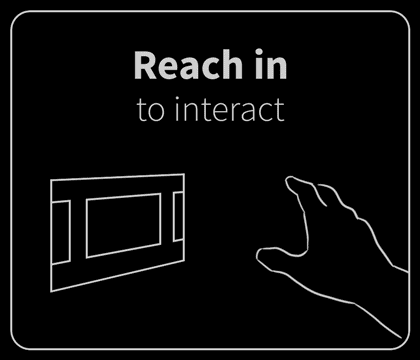
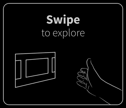
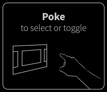
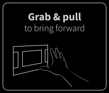
My goal was to build a gesture system based on familiar verbs like “grab,” “poke,” and “swipe,” as opposed to complex, prescriptive instructions like “extend your index and middle fingers forward, parallel to the keyboard.” Easier said than done!
The trick was finding gestures that were both natural and able to be reliably identified by the application. Paul and I studied the camera system’s strengths and weaknesses through countless rounds of iterative tweaking. Meanwhile, we ran a series of user interviews and tests to observe how people interacted in hypothetical scenarios and in front of functioning prototypes.
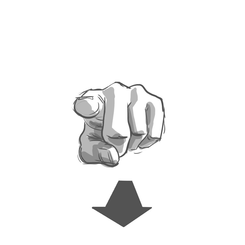
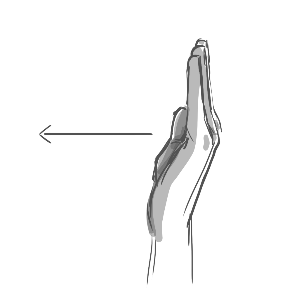
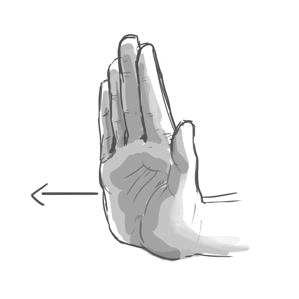
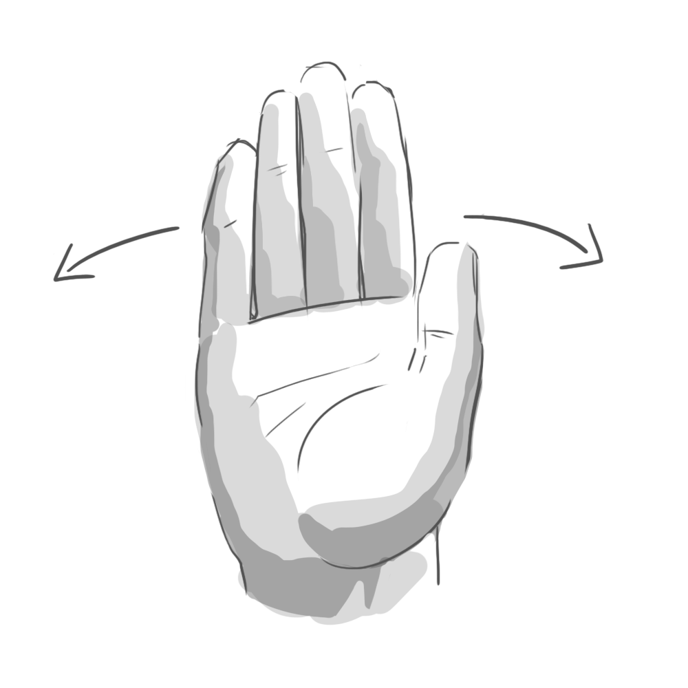
The results were fascinating. It turns out that when you ask someone to, say, “swipe” a UI element, they’ll perform a surprising variety of mid-air gestures. Some lazily point their index finger forward, wagging it in short, percussive motions. Others swish their whole hand, open-palmed. To “push,” some hold their palm parallel to the screen in a “stop” gesture. Others position their hand palm-down and brush their fingertips forward, as if to say “shoo!”
Programming every variation was impossible. Instead, we had to identify the commonalities. Our final system considered hand position, but primarily used acceleration and direction to determine intent. All those “swipe” gestures, for example, reliably involved quick bursts of lateral movement.
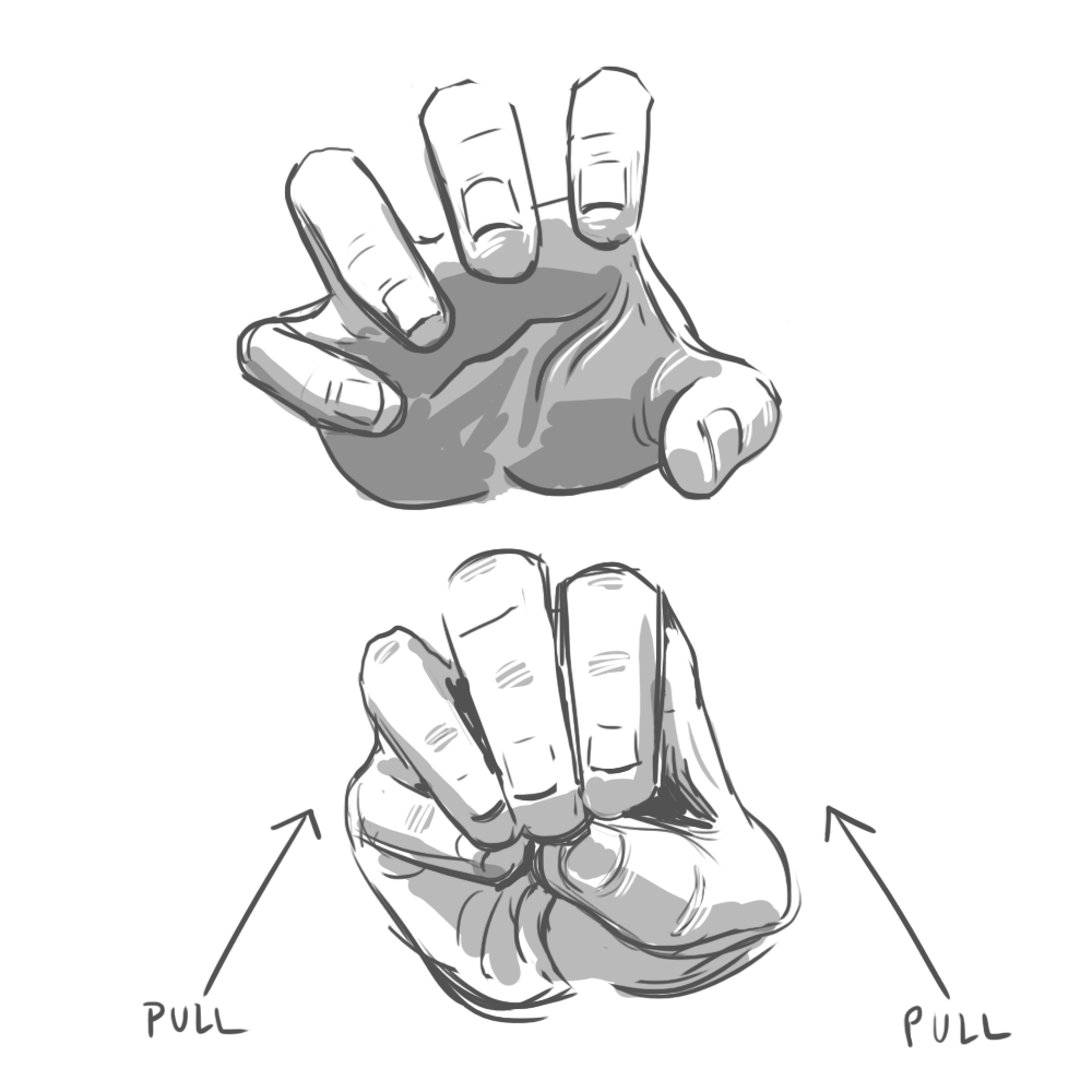
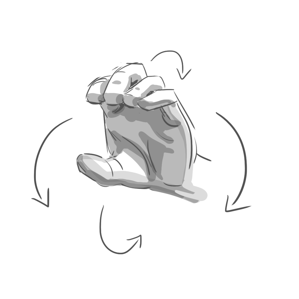
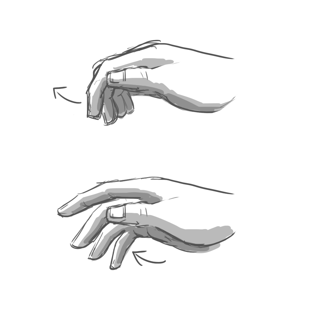
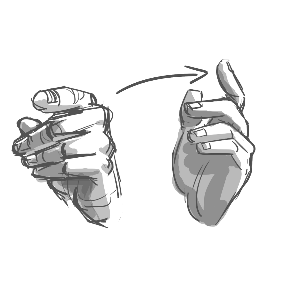
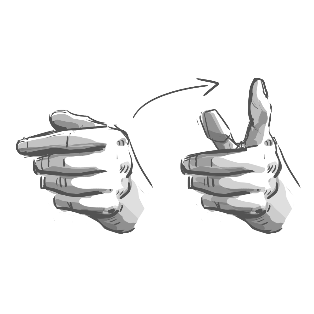
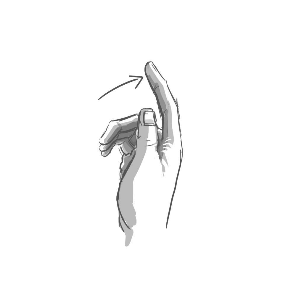
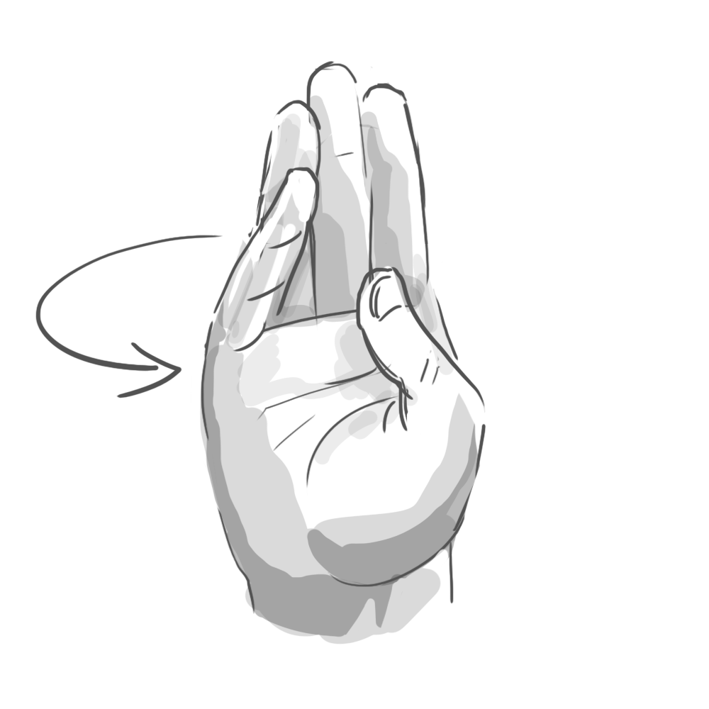
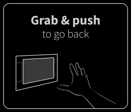
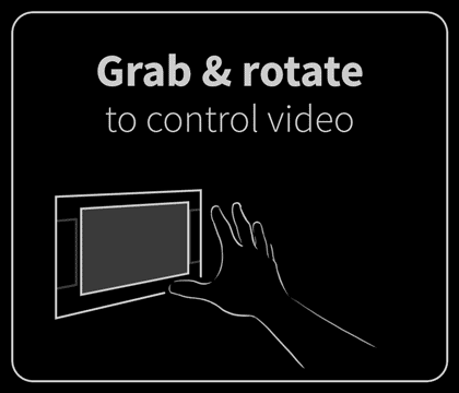
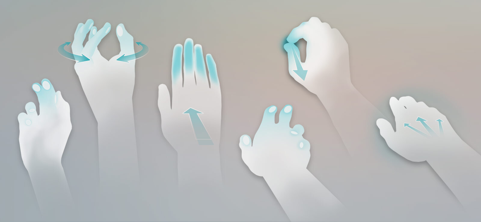
In the end, we identified six gestures that felt natural to users and were reliably detectable by the software: poke, swipe, grab, push, pull, and twist. These served as the foundation of our application.
Of course, as intuitive as these were, it was still a novel experience. User education was key. I drew (and lightly animated) the core gestures for navigating and interacting with the application. These were presented in a quick primer upon launching the app. It was helpful but underdeveloped. I wanted to explore user training more, but this simple interstitial was all we could accommodate within the project’s limited time.
Feedback
Moving one’s hands through the air to control an image on a flat display is more like a mouse than multi-touch; the interaction is indirect. For this to work, the interface needs to provide affordances (visual clues of potential interactivity), some kind of focus indicator, and clear, responsive feedback to the user’s actions. The computer can’t just translate the intent behind a user’s action. It has to show it—fluidly and consistently.
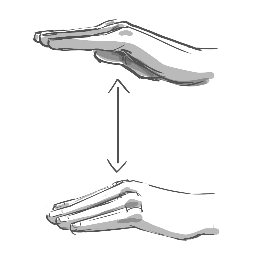
These conceptual animations illustrated how on-screen content might react to being pulled, poked, and stretched by the user.
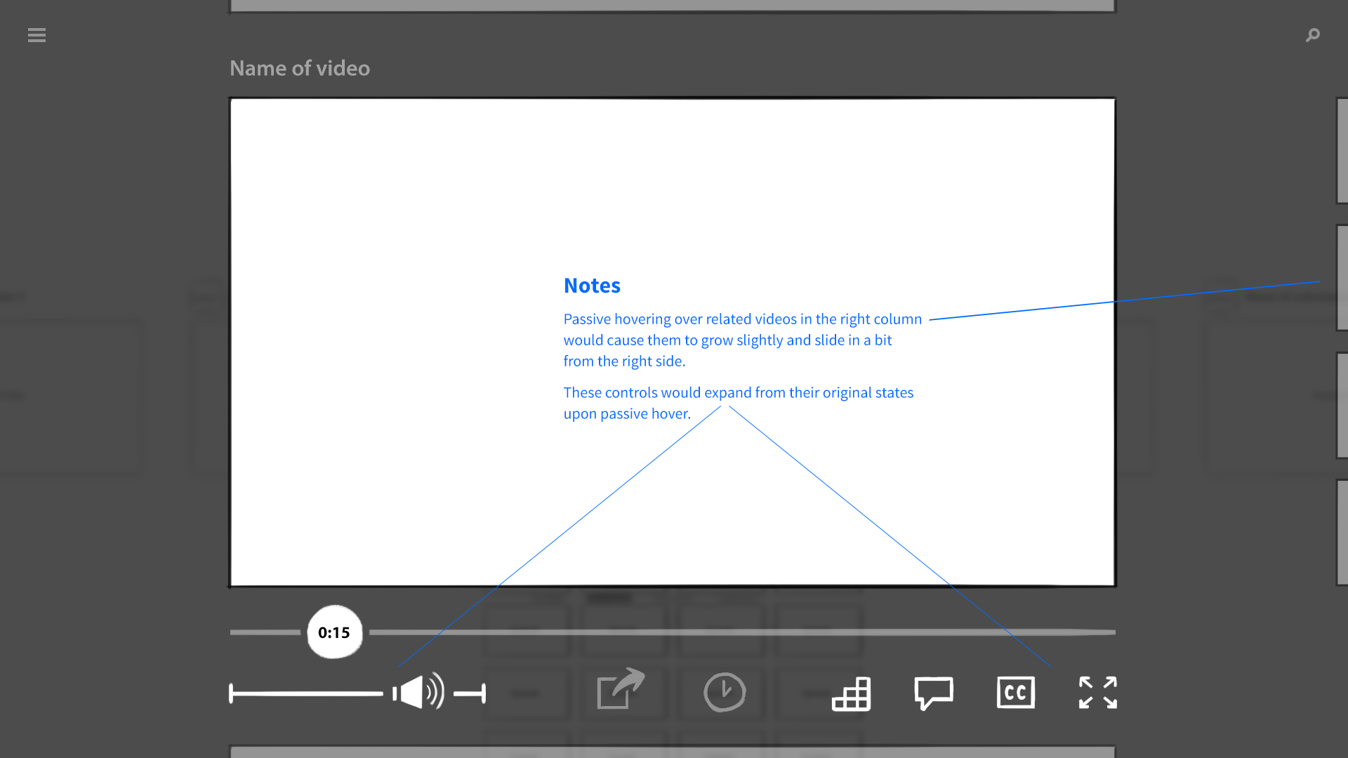
In a mouse-driven interface, the cursor communicates both focus and interactivity. The cursor smoothly tracks the mouse’s motion, and when it hovers over a web link, for example, it changes into a pointing hand. Other indirect systems forgo a cursor and indicate focus through highlight. Think of the modern Apple TV, which uses size and shadow to make the current selection appear as though it’s floating above the rest of the UI.
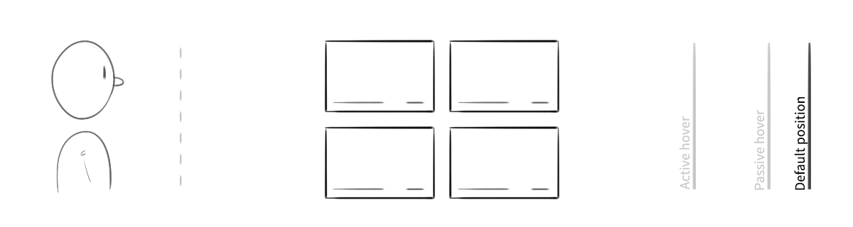
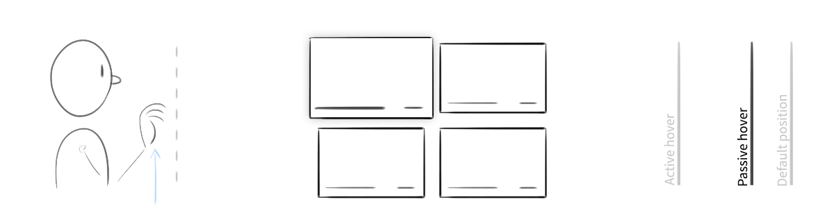
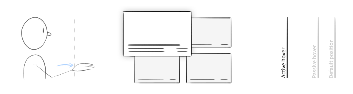
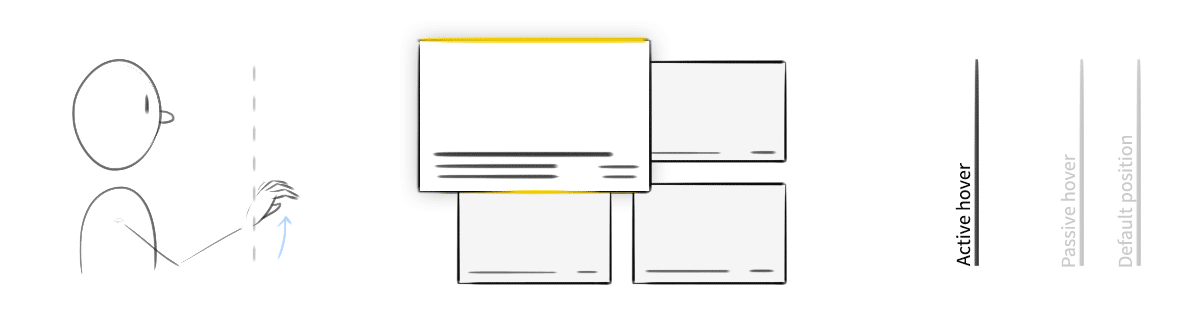
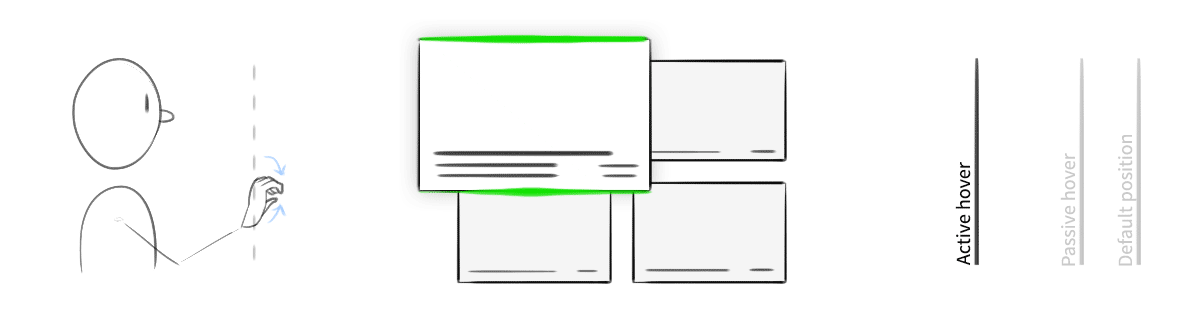
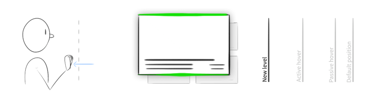
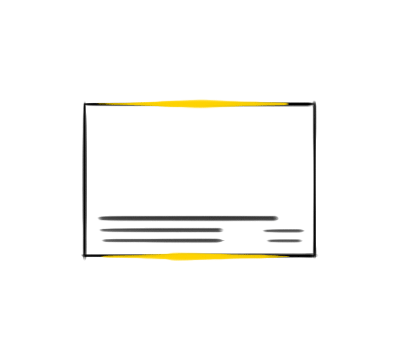
An exploration of "active" vs. "passive" hover. When the user's hand was in the safe zone and hovering over content, the object would elevate slightly. When engaged by a gesture, it would come further forward, and its edges would highlight.
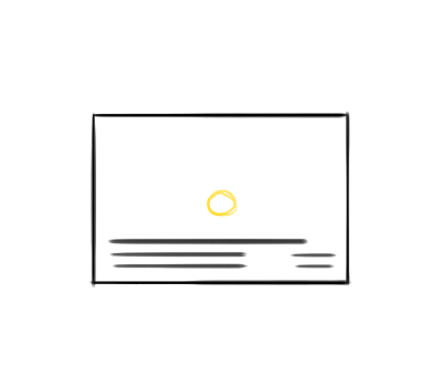
There was one more detail our system had to communicate, something that traditional mouse and touch interfaces didn’t. The camera had a sweet spot for gesture recognition, like the strike zone over home plate. When a hand was too far away, too close, or off to the side, the system wouldn’t work reliably. The UI would need to broadcast when it’s “safe” to gesture.
An early idea was to show a full, 3D-rendered hand that mimicked the user’s own. Aside from being an impressive visual feat, mirroring the user’s hand within the interface would narrow the gap of indirect manipulation. Unfortunately, this approach proved far too ambitious. It was computationally intensive, and when a user’s hand moved too quickly or some fingers were obscured, the 3D model would jump, skip, or bend into an anatomically impossible pretzel. There was also the issue of size. For it to feel right, the 3D hand had to look close to human scale, as though the user’s own hand was floating inside the screen. This meant an enormous cursor that, even if translucent, blocked far too much content.
We considered representing only the fingertips, which would be less computationally demanding, but was still too janky to use. The system simply couldn’t track fingers quickly or reliably enough. And so we pursued a simpler course.
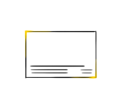
Our final cursor was a simple, semi-transparent circle. The circle would change size, shape, and color based on the position of the user’s hand. A distant hand would result in a small, dark cursor. The cursor grew as the user’s hand moved closer, then turned white when the hand entered the camera’s sweet spot. When a user interacted with a piece of content—when they grabbed a video, for example—the cursor turned a bright blue, as did the edges of the object.

The final app
The final application was a marvel to behold. Alex and Steve designed a gorgeous, polished UI, and Paul coded the richest, most computationally demanding web application I had ever seen. It wasn’t perfect, certainly. Despite our best efforts, the camera system was finicky, and for all Paul’s remarkable talents, there were limits to how well an app like this could perform in the browser. Still, when it was placed in front of users, it worked.

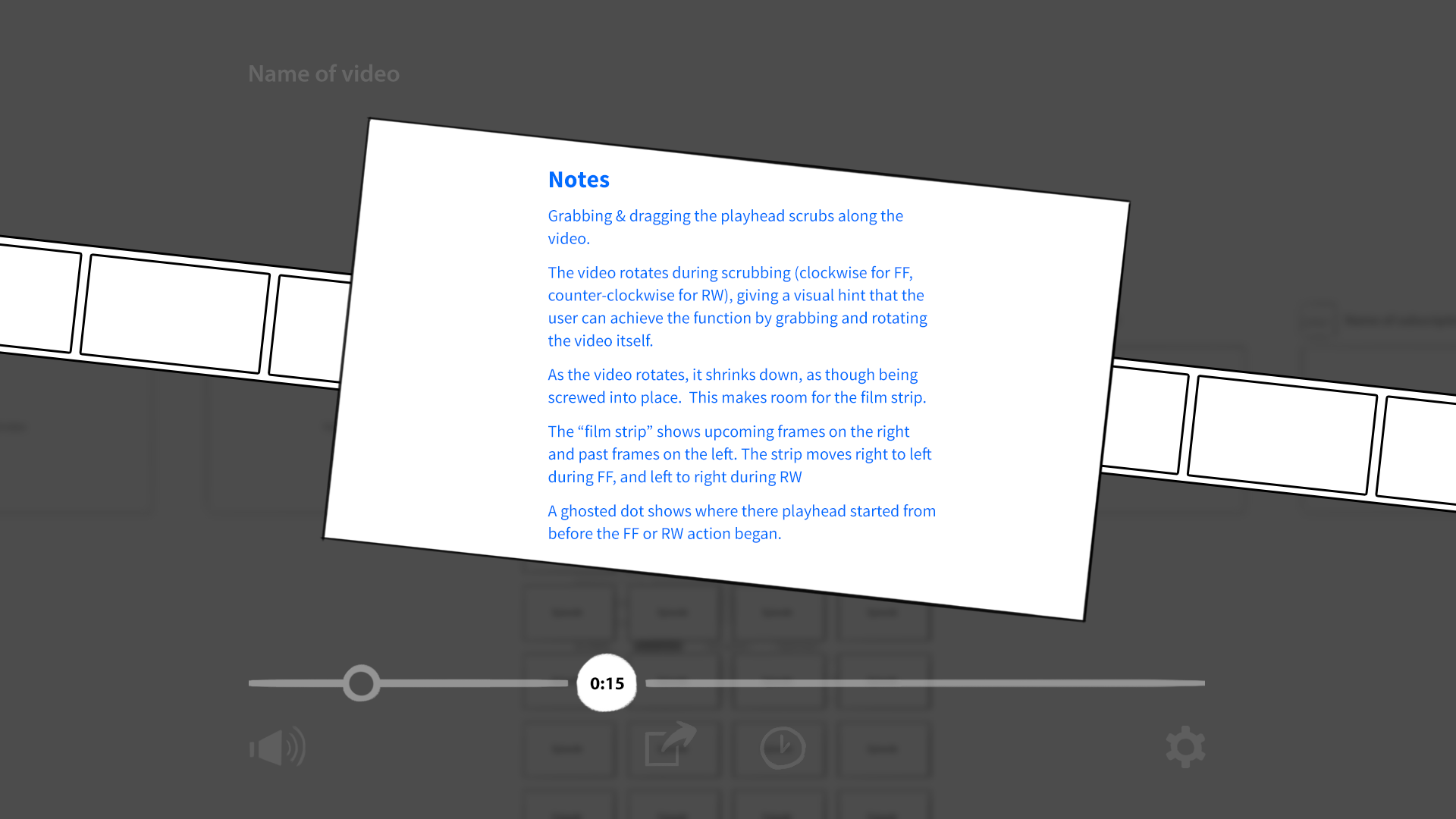
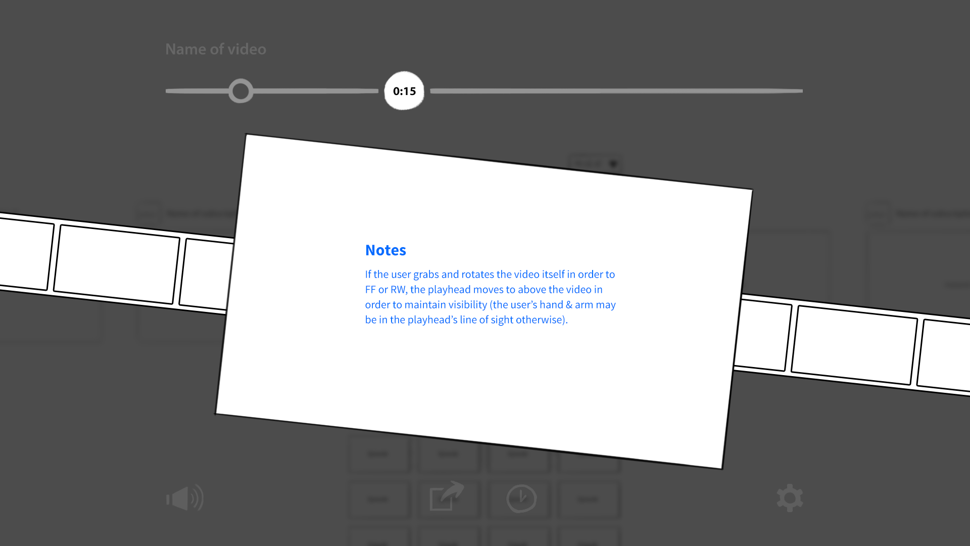
Testers successfully navigate YouTube without ever touching a keyboard, mouse, or screen. They swiped through channels and playlists. They grabbed and pulled videos out of thin air. They even understood our most obscure gesture: grabbing a video mid-playback and twisting it clockwise would fast foward, while twisting counter-clockwise would rewind.
More importantly, it was a success for our client. The prototype was demonstrated up and up the corporate ladder, ultimately reaching Intel's CEO, whose positive response resulted in additional funding for the Perceptual Computing Group's research. These technologies were branded as "Intel RealSense," and became directly integrated into laptops and tablets by companies like ASUS. RealSense was advertised in a series of TV spots starring Jim Parsons of The Big Bang Theory:
The future of computing
My work with Intel gave me a fascinating preview of the future of computing. Imagine a computer that understands a fluid mix of keyboard, mouse, touch, speech, hand gestures, eye tracking, and facial expressions. After all, that’s how we communicate with other people—a fluid mix of speech, touch, eye contact, hand gestures, body language, and more. This multi-modal interaction model will help computers better understand human intent, make them more accessible to those with disabilities, and introduce computing to entirely new contexts.
Personally speaking, this project also reinforced the value of user testing to me. Those of us on the team knew the camera’s strengths and weaknesses, and so we used only careful, deliberate hand motions. But user testing changed everything! Because our subjects had never controlled a computer via gesture before, they relied upon the closest analog they knew, and treated the computer like a person. They were photographers, waving their hands to scoot their human models this way and that. Their gestures were wild, inconsistent, and entirely human—and they worked terribly in our software! These insights helped us radically improve the application, and reminded me that there’s no substitute for testing.
A couple of abandoned interaction concepts: