Beginning in the summer of 2013, Fresh Tilled Soil partnered with the Massachusetts Port Authority (Massport) and Art of Context to overhaul the maps at Boston Logan International Airport. Our human-centered design process carefully considered the traveler’s needs, and involved thorough research, user interviews, usability tests, and airport walkthroughs. I served as lead designer for the project, with design support from my colleague Steve Hickey. For more details, check out the Fresh Tilled Soil case study.
Prior to our engagement, Logan Airport’s many maps were inconsistent and complex. The maps suffered from Massport’s own success, as each upgrade to the airport’s infrastructure introduced new variations, constantly bifurcating the wayfinding system. Our goal was to provide a single solution that would unify the mapping assets across the web, print, and signage throughout the airport. This new system would be built around those that relied on the maps most: the tens of millions of passengers that travel through Logan each year.
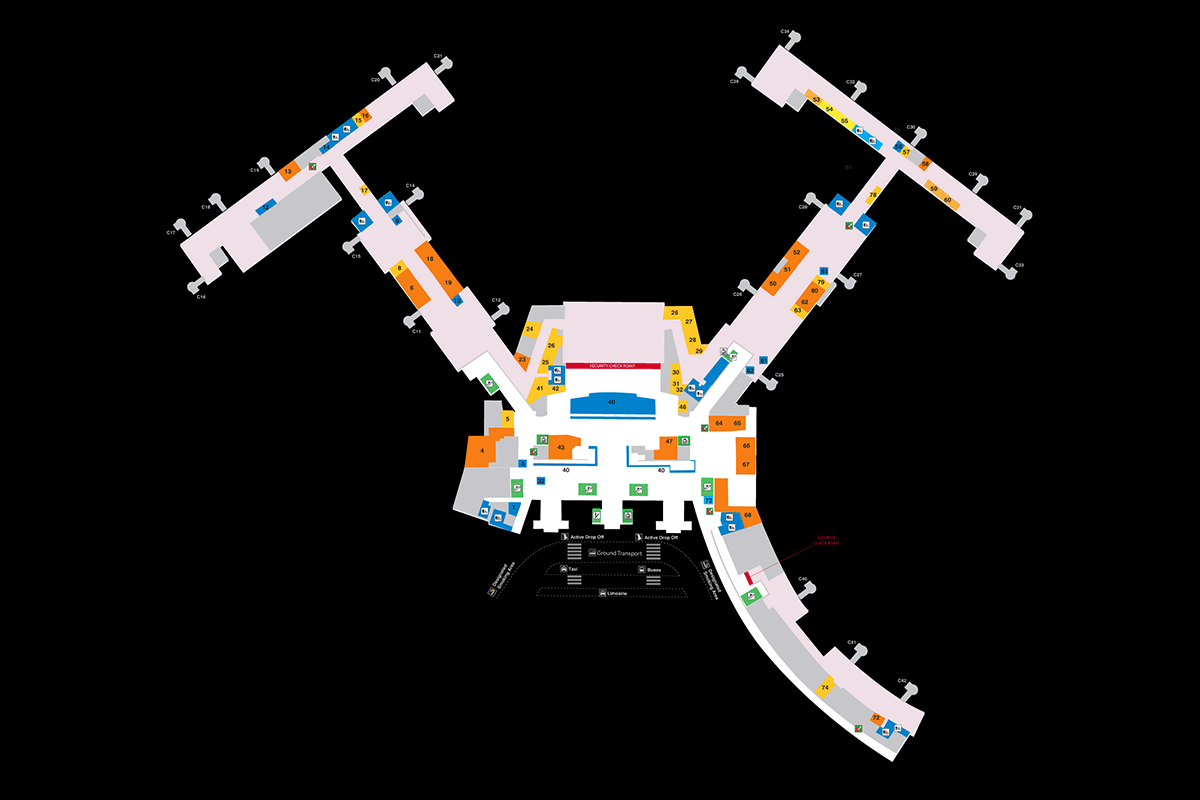
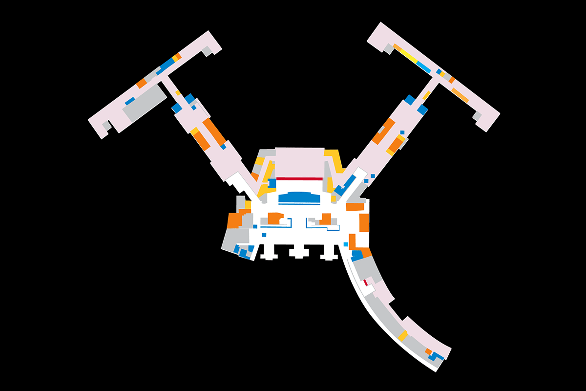
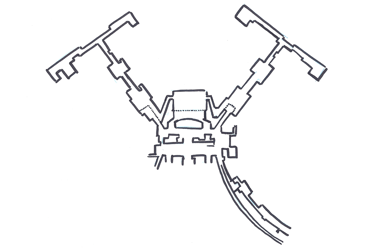
We quickly realized that the terminals’ exterior shapes, faithfully represented in the old maps with immense detail, were a distraction, largely irrelevant to travelers. I peeled away the jet bridges, stores, restaurants, and private airport offices until only public walkable space remained. This was an important early revelation, and helped inform the rest of the project. The simplified forms had an added benefit: updating the maps for future construction is now significantly quicker for Massport’s designers.

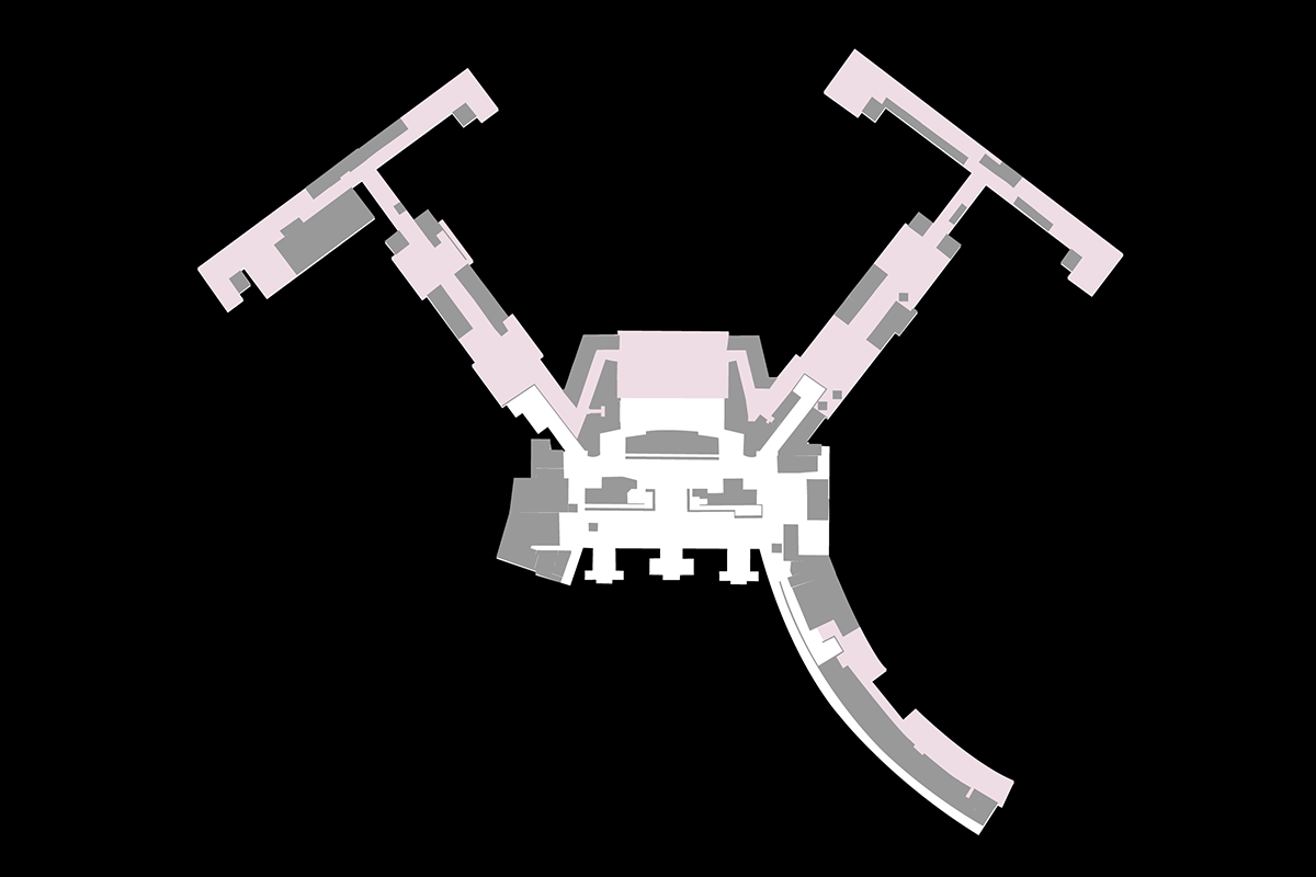
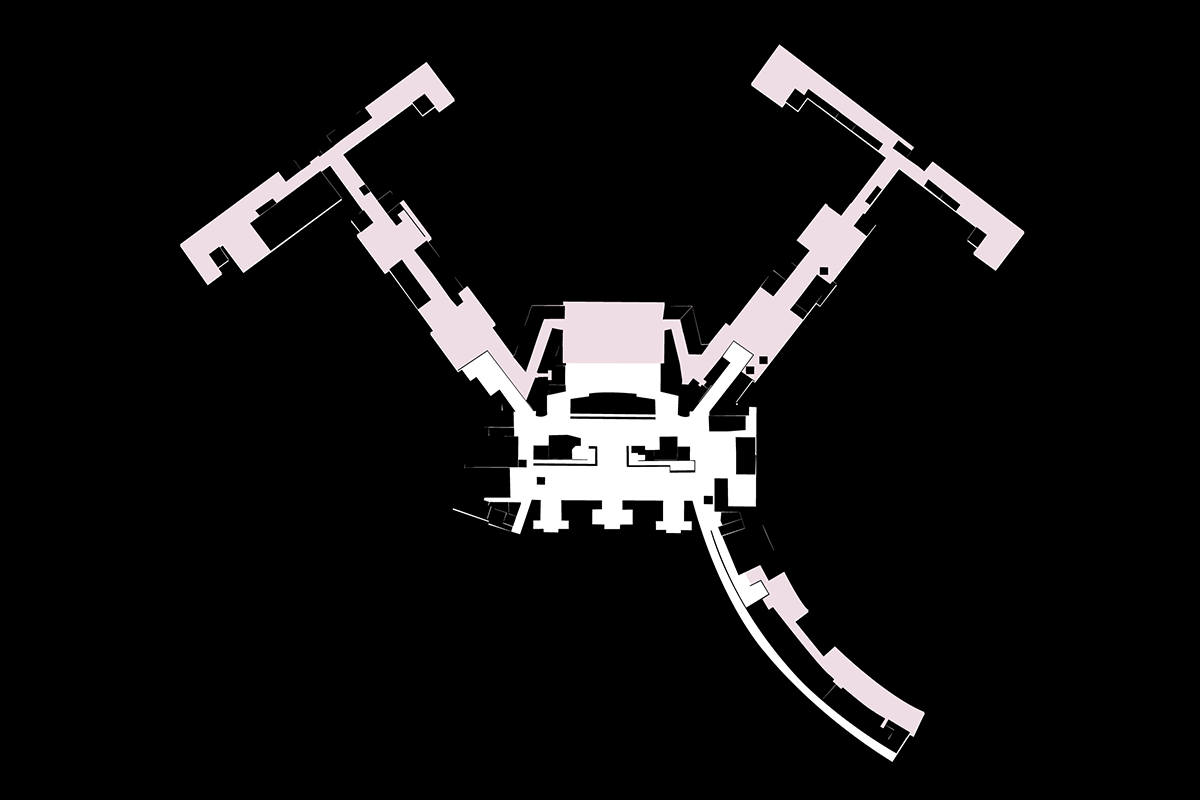
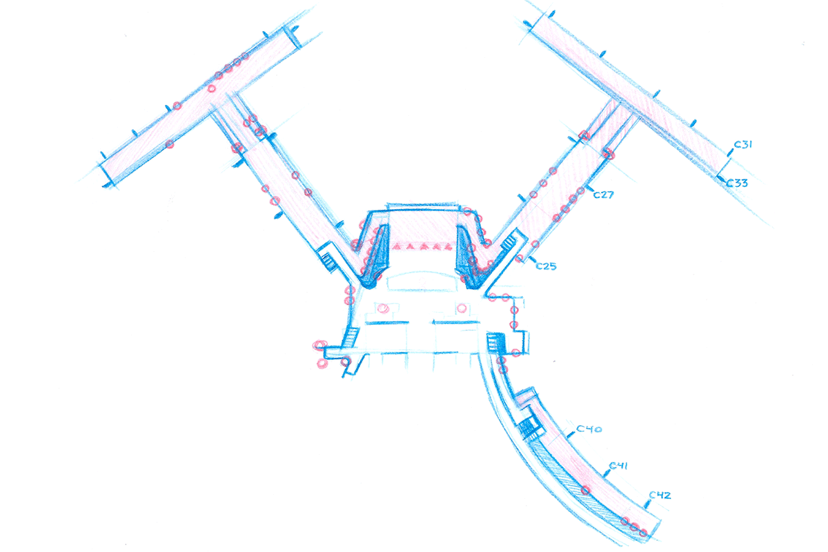
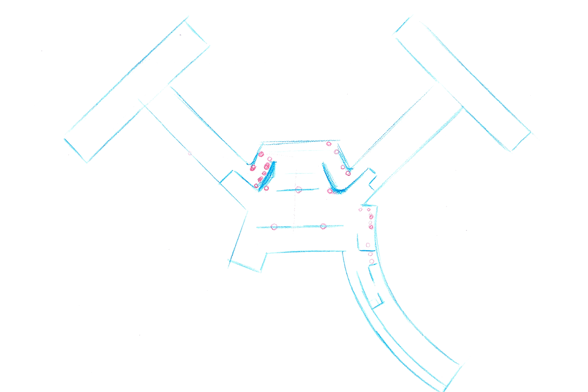
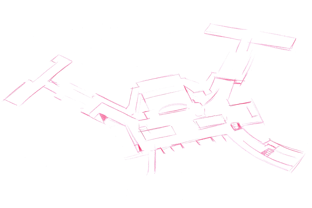
All that said, a simpler map is not an inherently better map. While too much detail can clutter and distract, oversimplification risks abstraction, making it difficult for travelers to connect the map with their environment. Finding the balance was an iterative process, involving countless sketches and revisions. The team regularly explored the terminals on foot, identifying where more detail was needed, and where it could be sacrificed.
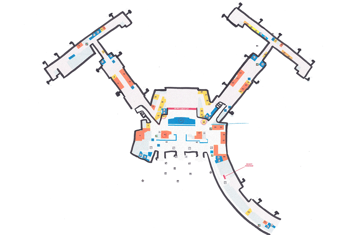
Logan Airport features a vast selection of services, amenities, facilities, and concessions. To maintain clarity, text was eliminated at every opportunity, leaving icons and numbered markers to handle the bulk of communication. But just as abstracting the map’s form backfired, overreliance on icons and numbers in my earliest drafts spelled trouble in usability tests, as users struggled with frequent jumps between the map and its legend. The final map employs a mix of standalone icons, text labels, and patterning. Color is never used as the sole differentiator between elements (to avoid confusion for color blind viewers), and the graphics were tested against common forms of color blindness to ensure an acceptable level of contrast for all users.
In addition to our work on the mapping assets, our team also designed and prototyped Massport.com’s new interactive web directory. I worked in a supporting role on the web application, which was led by Steve Hickey and brilliantly prototyped by Sarah Canieso. Art of Context built the final web application and integrated our maps into the airport’s dramatically revised digital signage. I was proud to see the work go live in mid-2014, where it’s since been used by millions of travelers.