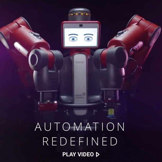
Rethink Robotics makes extraordinary robots for manufacturing and scientific research. At the company’s core is a profound vision of the relationship between humans and robots, and no wonder—co-founder Rodney Brooks is a robotics pioneer. That vision, however, was lost in its website, buried by a complex information architecture and unfocused design.
The site Fresh Tilled Soil crafted better illustrates Rethink’s compelling narrative and serves as a flexible platform for their future growth. I led the design and storytelling efforts, Hamy Pham and Kristy Stetson provided design support (as well as photography and information architecture expertise, respectively), and Sarah Canieso and Dave Romero spearheaded development, from the responsive front-end to the highly customized Wordpress installation. The full story is available in a Fresh Tilled Soil case study.
While the overall design effort was highly collaborative, there is one corner of the work I can call my own: the iconography.
Communicating the immense potential of Rethink’s flagship robot, Baxter, had historically proven challenging. First, Baxter rarely replaces an existing machine in a simple one-two swap. It’s a highly flexible robot that excels at mimicing the repetitive, manual tasks often relegated to low-level line workers. Adding Baxter necessitates creative thinking, shifting the production line around to best capitalize on its unique strengths. Second, Rethink’s sales team found that many prospects saw themselves in narrow terms. When shown examples of Baxter working in factories or situations that didn’t closely match their own, many potential clients said “Baxter isn’t for me,” and the deal was lost.
Custom iconography paired with clean storytelling helped to bridge these communication gaps. We worked with Rethink’s team to identify Baxter’s five primary applications: kitting, packaging, loading & unloading, machine tending, and material handling. The icons I developed over countless rounds of paper sketching and vector tweaking lack any suggestion of a specific product or material. Given that Baxter’s “hands” are interchangeable (grabbing pincers may be swapped out for vacuum suckers), I even removed any suggestion of the robot itself, instead focusing on the action it takes. The resulting icons appear throughout the site, paired with short descriptive text and tightly shot videos that focus on interaction over environment.
Shown below are just a few of the countless variations created during the iterative design process, as well as a handful that are found elsewhere on the website.
Rethink Robotics is pioneering the future of robotics in manufacturing and research, and it was a real joy and honor to work with their team.
When I joined Circle as its third product designer, Circle Pay was available on iOS, Android, and the web. With my arrival, each designer could focus on a single platform. In my case, that meant our oldest app, Circle Pay for web. As I tackled the design of new features, I also sought to untangle inconsistencies, improve our internal design and development workflows, and build a solid, scalable foundation for the app’s future.
In 2013, a team within Intel’s R&D division called the “Perceptual Computing Group” approached Fresh Tilled Soil with a curious bit of technology: a depth-sensing camera that could recognize objects in 3D space. Paired with the right software, this would enable computers to understand human hand gestures. My colleagues and I designed and developed a fully-functioning prototype application that would demonstrate the technology’s extraordinary potential.
As a Product Designer & Illustrator at Circle, it’s my job to manage and grow our custom icon set. I’ve built each icon according to the system Steve Stone outlined in Icon Sets with color override in Sketch. It's great …with one caveat. Sometimes, a designer needs to venture outside the brand palette.
Note: I have also published a version of this post to Medium
For more than 80 years, Titleist has made “the #1 ball in golf.” The storied company came to Fresh Tilled Soil with a website that had grown too cumbersome; it was inflexible, mobile unfriendly, and in need of a visual and UX overhaul. Our team set out to craft a modern, fully responsive site that captured the brand’s timeless classicism. I worked alongside some of Fresh Tilled Soil's most senior creative talent, and contributed to the project's visual design, conceptual development, wireframing, prototyping, icon design, and more.
In partnership with Art of Context and Massport, Fresh Tilled Soil overhauled the terminal maps for Boston Logan International Airport. I was proud to lead the design efforts, using our human-centered design process to create entirely new mapping assets that have since been used by tens of millions of travelers.
Rethink Robotics makes extraordinary robots for manufacturing and scientific research. At the company’s core is a profound vision of the relationship between humans and robots, and no wonder—co-founder Rodney Brooks is a robotics pioneer. That vision, however, was lost in its website, buried by a complex information architecture and unfocused design. The site Fresh Tilled Soil crafted better illustrates Rethink’s compelling narrative and serves as a flexible platform for their future growth.
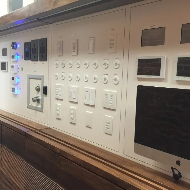
OneVision Resources is a personal technology and health concierge company. With the dizzying array of products available, they needed an elegant way to demonstrate the promise of smart home technology to their customers. OneVision partnered with Fresh Tilled Soil to develop an interactive, fully-functional display that would allow their clients to experience and compare multiple smart home solutions.
The team at MoveableCode saw an opportunity: technology could enable new directions in storytelling and gaming, using the virtual to connect us with our physical world like never before. The result was Incantor, an innovative mobile game that sought to make magic real. Along with my colleagues at Fresh Tilled Soil, I helped to refine and design the game, from its mechanics and mythology to its unique visual language.
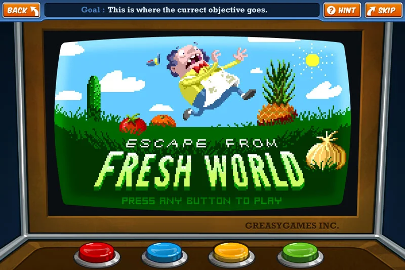
CloudKid is an extraordinary, Emmy-nominated creative agency specializing in animation and interactive children's media. As a member of their team in 2011, I proudly contributed to a number of client projects, primarily a suite of games for the fantastic Fizzy's Lunch Lab.