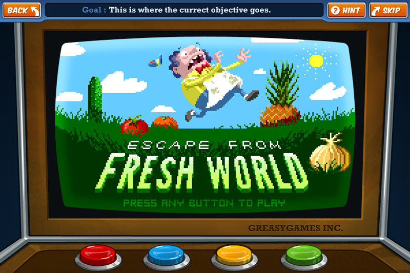
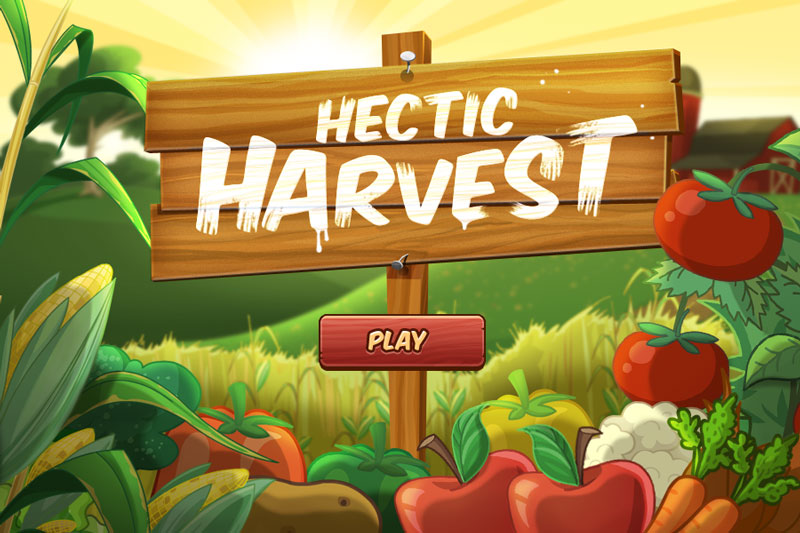
CloudKid is an outstanding interactive studio based out of Boston, MA. Their web-series for PBS Kids, Fizzy's Lunch Lab, teaches children the value of healthy eating through animated webisodes, tasty recipes, clever music, and seriously fun games. For its work on the Lunch Lab, CloudKid has been nominated for a Daytime Emmy in New Approaches in Children's Programming three times: in 2010, 2011, and 2012.
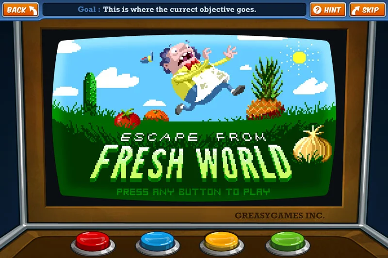
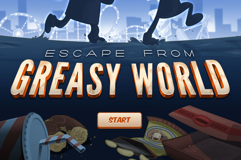
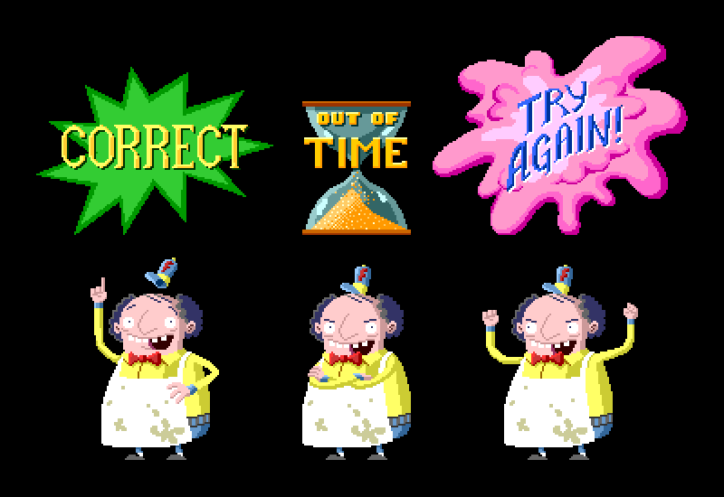
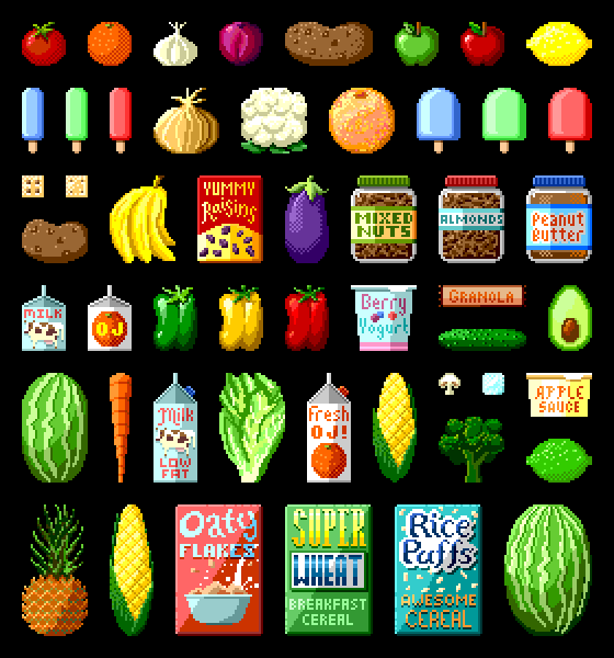
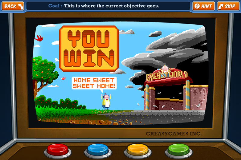
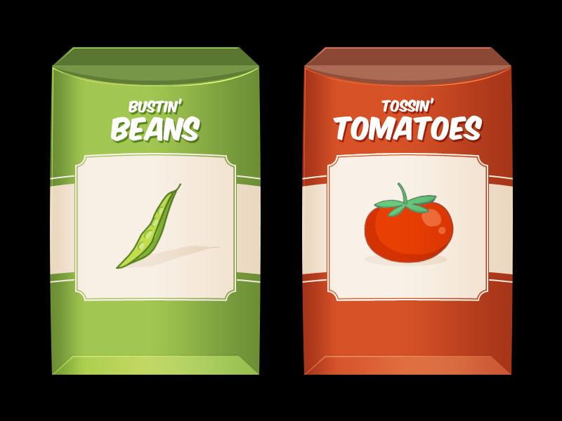
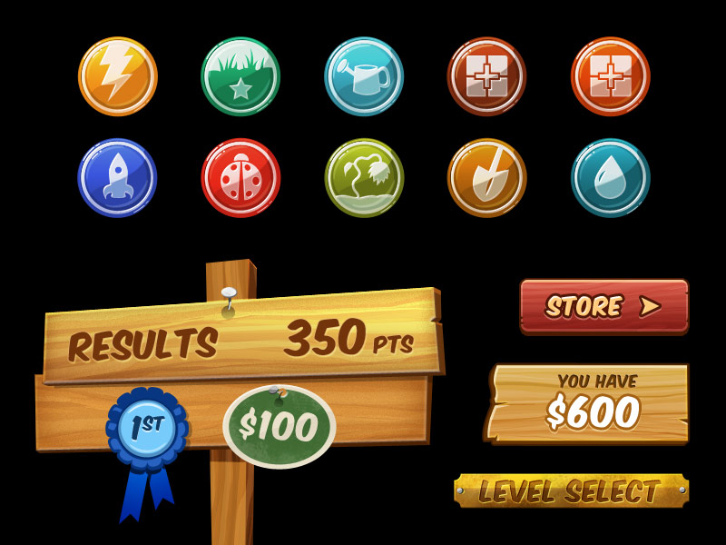
I joined CloudKid as a graphic designer during the second season, when the studio was in the midst of producing a slew of new games for the Lunch Lab site. The majority of my work was on Escape from Greasy World, the company's largest, most ambitious interactive experience to date. My tasks varied widely from day to day, and included conceptual sketching, iconography, logo and identity development, interface design, and illustration. The work you see here is a selection of my best work done for the Lunch Lab, including the title screens from four games and countless interface elements. During my time at CloudKid, I also contributed to the early development of Peg+Cat, iRead, and Negative Nimbus.
While some pieces were largely my own from start to finish (I take special pride in my pixelated illustrations for Escape), many were bolstered by the immense talent in the studio. CloudKid's culture espouses iterative & cooperative development, and it was common for a piece to bounce actively between three or four different artists until perfection was found.
I encourage you to explore the wealth of fantastic content at Fizzy's Lunch Lab. It's a great resource for parents and teachers alike, and kids love it.
More Product Design
When I joined Circle as its third product designer, Circle Pay was available on iOS, Android, and the web. With my arrival, each designer could focus on a single platform. In my case, that meant our oldest app, Circle Pay for web. As I tackled the design of new features, I also sought to untangle inconsistencies, improve our internal design and development workflows, and build a solid, scalable foundation for the app’s future.
In 2013, a team within Intel’s R&D division called the “Perceptual Computing Group” approached Fresh Tilled Soil with a curious bit of technology: a depth-sensing camera that could recognize objects in 3D space. Paired with the right software, this would enable computers to understand human hand gestures. My colleagues and I designed and developed a fully-functioning prototype application that would demonstrate the technology’s extraordinary potential.
As a Product Designer & Illustrator at Circle, it’s my job to manage and grow our custom icon set. I’ve built each icon according to the system Steve Stone outlined in Icon Sets with color override in Sketch. It's great …with one caveat. Sometimes, a designer needs to venture outside the brand palette.
Note: I have also published a version of this post to Medium
For more than 80 years, Titleist has made “the #1 ball in golf.” The storied company came to Fresh Tilled Soil with a website that had grown too cumbersome; it was inflexible, mobile unfriendly, and in need of a visual and UX overhaul. Our team set out to craft a modern, fully responsive site that captured the brand’s timeless classicism. I worked alongside some of Fresh Tilled Soil's most senior creative talent, and contributed to the project's visual design, conceptual development, wireframing, prototyping, icon design, and more.
In partnership with Art of Context and Massport, Fresh Tilled Soil overhauled the terminal maps for Boston Logan International Airport. I was proud to lead the design efforts, using our human-centered design process to create entirely new mapping assets that have since been used by tens of millions of travelers.
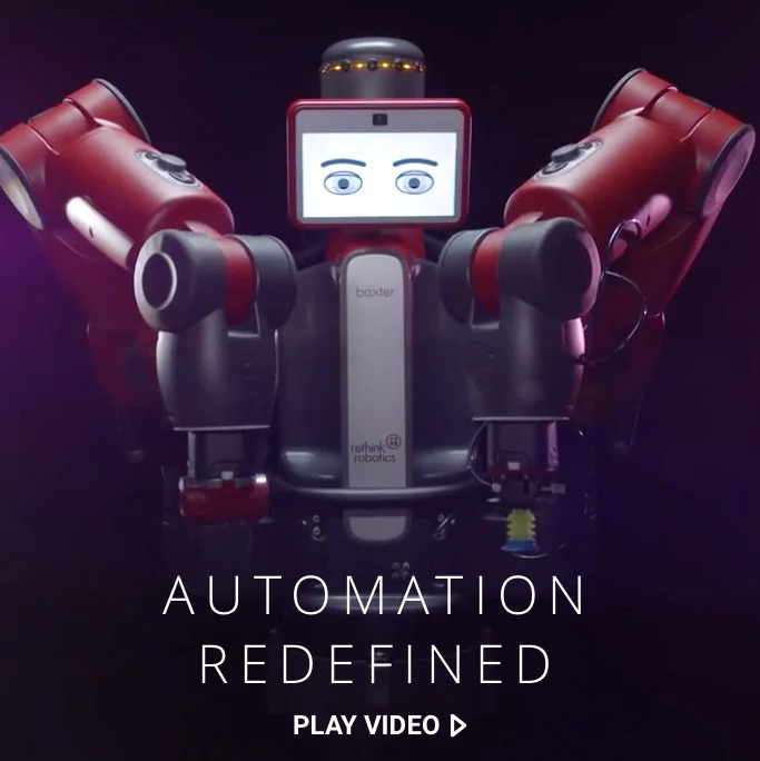
Rethink Robotics makes extraordinary robots for manufacturing and scientific research. At the company’s core is a profound vision of the relationship between humans and robots, and no wonder—co-founder Rodney Brooks is a robotics pioneer. That vision, however, was lost in its website, buried by a complex information architecture and unfocused design. The site Fresh Tilled Soil crafted better illustrates Rethink’s compelling narrative and serves as a flexible platform for their future growth.
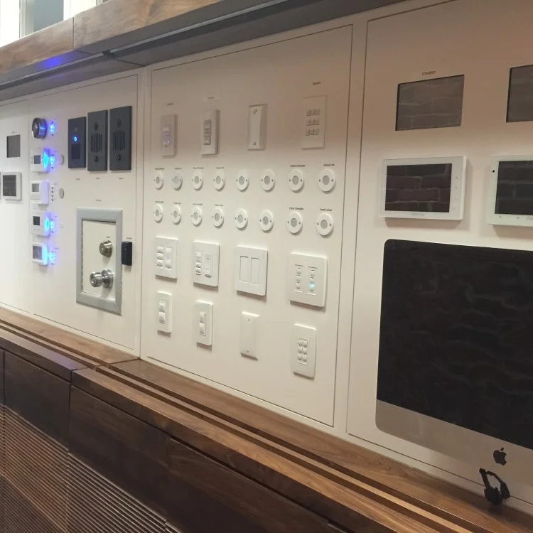
OneVision Resources is a personal technology and health concierge company. With the dizzying array of products available, they needed an elegant way to demonstrate the promise of smart home technology to their customers. OneVision partnered with Fresh Tilled Soil to develop an interactive, fully-functional display that would allow their clients to experience and compare multiple smart home solutions.
The team at MoveableCode saw an opportunity: technology could enable new directions in storytelling and gaming, using the virtual to connect us with our physical world like never before. The result was Incantor, an innovative mobile game that sought to make magic real. Along with my colleagues at Fresh Tilled Soil, I helped to refine and design the game, from its mechanics and mythology to its unique visual language.
CloudKid is an extraordinary, Emmy-nominated creative agency specializing in animation and interactive children's media. As a member of their team in 2011, I proudly contributed to a number of client projects, primarily a suite of games for the fantastic Fizzy's Lunch Lab.
More Brand & Identity Projects
In late 2019 and early 2020, Circle sunset, sold, or spun out every one of its consumer products, and dedicated itself to building B2B USDC services. Naturally, it was time for a rebrand! Though I had left the company months before, my friend and former colleague Kristine asked me to once again define the company’s illustrative brand—this time as a freelancer.
When I joined Circle as a product designer, I was hired, in part, for my background in illustration. But that “nice to have” soon became my central focus. I’ve spent years defining and evolving the Circle illustrative brand, cementing its place in our products, website, marketing campaigns, and more.
How to Draw a Startup is a new personal project of mine, a podcast miniseries about the evolving role of illustration in the tech industry. I spoke with over a dozen illustrators, designers, art directors, educators, and more to understand why illustration is used, how illustrated brands are crafted, and where illustrators fit in creative teams.
In 2018, CENTRE launched USD Coin, a stablecoin pegged to the value of the US Dollar. Less than a month later, Coinbase joined Circle to formally found the CENTRE consortium, and with that announcement came a whole new look for USDC. That’s right: even the most diehard crypto fan might not realize that for the first four weeks of its life, the world’s largest, fastest-growing stablecoin had a completely different visual identity. So who’s the poor sap who designed that first logo?
[cough cough]
Circle was founded on the belief that blockchain technology could usher in a more open and inclusive global economy. But such a future can’t be built within the walls of a private company. It requires open standards and partnerships. That’s why, in 2017, Circle announced CENTRE, a “foundation, open source project, protocol, and network aimed at breaking down the barriers which cost us money and time to connect to each other financially.”
From 2014–2017, I helped run Refresh Boston, a free meetup for Greater Boston's design and development community, and the local chapter of the international Refreshing Cities collective. We were proud to feature extraordinary speakers and consistently draw an engaged, inquisitive crowd.
In 2015, Fresh Tilled Soil celebrated its tenth anniversary. To set the course for the next ten years, I proposed that we revisit the company’s branding and identity. With most of our energy focused on clients, our own marketing collateral and website updates were squeezed into the margins, and the identity lacked a cohesive visual system. Leadership agreed, and soon Fresh Tilled Soil itself became my sole client.
CloudKid is an extraordinary, Emmy-nominated creative agency specializing in animation and interactive children's media. As a member of their team in 2011, I proudly contributed to a number of client projects, primarily a suite of games for the fantastic Fizzy's Lunch Lab.
When Fresh Tilled Soil made coded style guides a standard deliverable, they produced a simple framework to simplify the process of making them. When it came time to open source the project, it needed a name and a logo. Corkscrew was born, and along with it, a fun little duck.

In one of my favorite projects of 2015, I tackled a logo for an up and coming kids brand—and I mean "kids brand" literally; it's made by an 8 year old. Cole Benoit makes and illustrates awesome handmade paper puppets. I helped give his company, Papar Pupit Pepol, some professional polish.