In late 2019 and early 2020, Circle sunset, sold, or spun out every one of its consumer products (and its OTC trading desk). The company was left with a singular focus: building technologies and B2B services centered around USDC, the enormously popular stablecoin Circle pioneered (and I helped brand) in 2018.
This extraordinary transformation called for a refresh. Circle’s Creative Director Kristine MacAulay crafted a fantastically fresh new brand and visual identity, which was unveiled in spring 2020 (and detailed in her great case study). I’m proud to have made early contributions to the color palette and logo, but I left Circle before the project kicked into high gear. Imagine my excitement when Kristine asked me to chip in as a freelancer!
During my three and a half years at Circle, I defined and championed our illustrative brand. Kristine knew that illustration could continue to play a key role in Circle’s brand expression, but the old look no longer applied. She asked me to craft a whole new illustrative voice.
Jobs to be Done
A classic illustration from Circle’s “Pay days”
Circle’s old illustrative brand was rooted in the “Pay days,” when Circle Pay was the company’s only product. Back then, illustration had a few obvious jobs to do: capture Pay’s (and therefore Circle’s) fun, approachable spirit and demonstrate potential use cases (sometimes very literally, like in this graphic for group payments). The style evolved to accommodate new products and audiences, but the job remained largely the same, and the style’s playful, B2C origins were undeniable.
What’s the purpose of illustration for a B2B-focused brand? One “job to be done” remained the same—to establish the brand’s tone and personality—it’s just that Circle had a new tone, a new personality. And where the old brand directly illustrated consumer use cases—lots of beers and pizzas and utility bills and concert tickets—we decided the new brand should visualize the spirit of complex concepts. There would be no literal explanation, no functional diagrams. The new illustrations would suggest the underlying structures, features, and benefits of Circle’s offerings.
The new illustration style should speak in the same voice as the new Circle brand: Circle is intelligent, reliable, warm, global, and inclusive. In addition, I sought to evoke four key concepts:
Inflection Point
Stablecoins are having their moment at last. Things aren’t going back. Circle is future first.
Programmable Money
Dollars, but better! More powerful, more modern, more capable. Circle unlocks new possibilities.
Duality
All that said, the past isn’t bad or wrong. Circle’s technology is complementary to traditional finance, not a pure replacement. Circle is a bridge between worlds.
Empowerment
Circle enables you to cross that bridge, to ride the wave, to take part in the future today.
Part 1: Feature Graphics
Kristine and I agreed the style would eventually call for imagery of all sizes and complexity, from full-bleed hero images to small spot graphics. My first mission fell somewhere in the middle: a series of five large illustrations to headline five new pages on Circle.com. These images would establish a new visual language, defined by common textures, forms, visual metaphors, and other cues.


The style juxtaposes shiny, glass-like elements (representing Circle’s futuristic technology and perspective) against textural, heavier objects: physical US coins and bills. Note that the physical currency doesn’t look gross or rusted. We’re not insulting it! Per the “duality” concept, these two worlds interact in tandem.
Between those two elements, you'll often find a grid of dots. It's an intermediary, a translation layer. Traditional currency is broken down and rebuilt again—from monolithic object to millions of atoms to infinite electrons—made compatible with the new.
Lastly, the system moves away from relying on any one illustrator’s hand. Whereas Circle’s old illustrations were clearly rooted in my personal drawing style, the new look is more photo collage. Any brand designer with decent Photoshop chops can work in this style, no cartooning ability required. I wanted to empower Kristine and her new (and future) team of brand designers to expand the system with works of their own.
The illustrations
While the overall style establishes tone and brand voice, each individual graphic must tell its own story. The assignment called for five illustrations: one to lead a “Circle Business Account” page, and the other four on “use case” pages. Let’s start with the use cases:

Accept and make payments globally
A glass-like USD Coin, a physical US dollar coin, and a central circle of subtly textured dots revolve around each other—or perhaps the two “coins” are revolving around a dotted Earth? Maybe they’re three sides of the same coin, an Escher-esque impossible object. Free from literal representation, the graphic evokes a sense of balance and interconnection, of effortless movement between new and old. Value is exchanged fluidly around the world and across infinite points.

On- and off-ramps in your crypto product
A Circle-powered business or application has many layers. I used to joke that user-friendly Circle Pay was a “crypto mullet,” with familiar fiat in the front, blockchain in the back. Circle’s new offerings offer something similar to their business customers: an app that integrates Circle APIs can present its own unique brand, visual identity, and user experience while Circle operates in the background, seamlessly juggling digital assets, fiat currencies, technical infrastructure, et cetera.

Send mass payouts globally
The US dollar is a sort of planet, a central source of trust and gravity. A near-infinite web of micro transactions orbit around it at a scale and pace well beyond human comprehension—and beyond human bookkeeping. Circle automates and simplifies this delicate dance of millions of satellites. However the money moves—one party to many, many to one, many to many, or one to one—Circle has it under control.

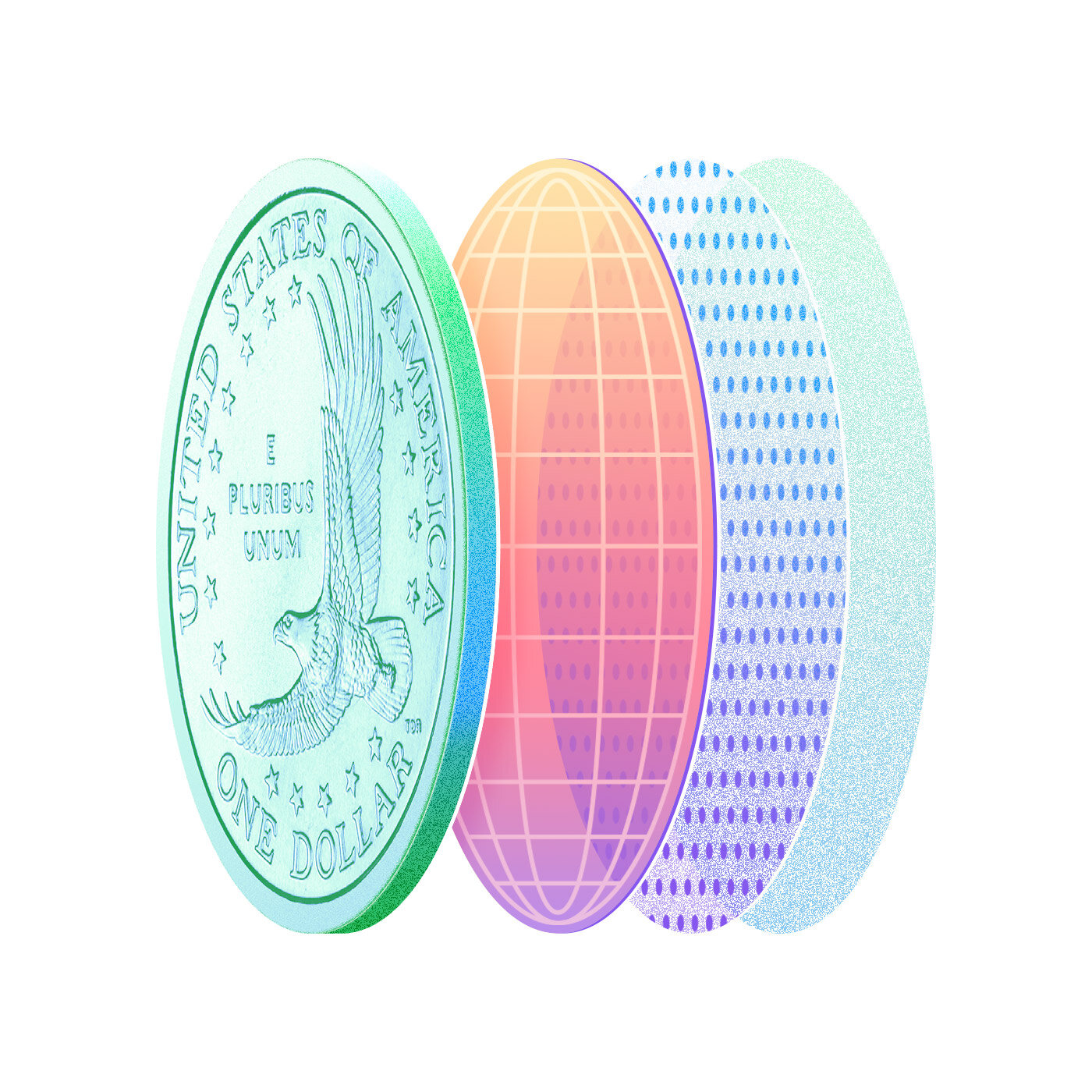
Add digital dollar accounts
The US dollar is valued, trusted, and desired around the world. Here, it is a solid base upon which to build, an enormous pool of assets to be shared. The dot layer is an intermediary, lifting and atomizing the dollar into the digital world. Above, we see glassy, shiny pools of various sizes, representing customer accounts. These digitally-native accounts are backed by the dollar’s timeless strength, but float free from the constraints of traditional finance. Customers enjoy the best of both worlds.
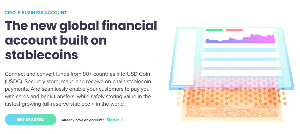
Circle Business Account
As the only illustration in the set tied to an actual product (as opposed to a use case), this graphic is also the most literal. Like in the “digital dollar accounts” illustration, a US dollar serves as a foundation while a dot layer floats above. Up top, we see a shiny pane of glass with suggestions of a customer dashboard, a literal interface between the old and new worlds.
Part 2: A flexible system
With five tentpole illustrations completed, we turned our attention to smaller graphics. In the months ahead, Circle was going to need countless spot illustrations for the new customer portal, Circle.com, social media, sales collateral, and more. Given the enormous wishlist and limited resources, scalability was priority number one.
Kristine asked me to build a modular illustration system based on swappable vector elements, which would enable her and her team to build an infinite library of spot graphics. The aesthetic should complement the new hero image style while being far simpler—no photography or complex textures.
As I reviewed Kristine’s list of high priority illustration needs, I realized that each of them was fundamentally about the relationship between a group of concepts, such as Circle APIs, technical features, product benefits, or economic principles. As part of the rebrand, Kristine had already licensed, tweaked, and expanded an icon set to communicate these kinds of concepts. By building my system around these icons, any designer could easily make a unique spot illustration, no drawing skills required. They’d simply consider the story they wished to tell, select some metaphorically appropriate glyphs, and arrange them into a compelling visual.
The Solution
After a bit of sketching and exploration, we nailed our look. In each illustration, each icon is placed over a brightly colored foreground shape and lit with an ethereal glow. Designers can choose from different shape arrangements, change colors, and swap icons. I also included a handful of soft background treatments that convey a sense of depth and abstract environment.


Three Motifs
All of the foregrounds and backgrounds are bucketed into three visual themes: floating orbs, blobs, and chemistry sets.


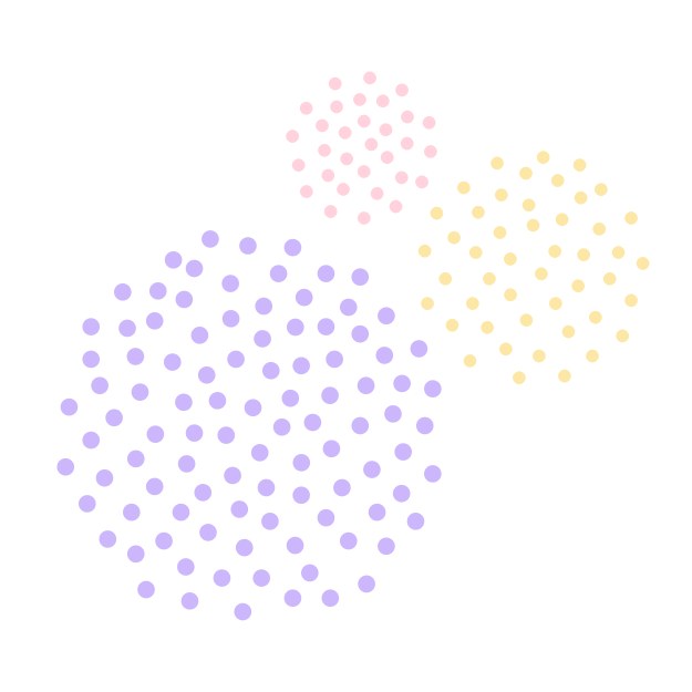
Floating orbs
The icons are clearly interrelated, but not directly connected. Their relationships are further defined by placement and sizing. Some layouts use equally sized orbs in a geometric grid, which could signify that the icons’ concepts are equal. Others feature haphazardly-placed orbs of different sizes, suggesting a hierarchy of importance.


Blobs
Like the floating orbs, this set’s shapes come in different sizes and arrangements. Unlike the orbs, though, they are directly connected in a sort of goopy, organic manner. The relationships here are tighter, yet fluid, never stilted.


Chemistry set
As the name suggests, each icon is its own, separate node, connected to others by a rod. This is used to show concepts that are connected, but still distinct. The arrangements feel less organic, more geometrically.


Icon treatment


I also gave the icons themselves some attention. Kristine’s set was all linear, which didn’t give us the effect we were looking for. I redrew about two dozen icons as solid forms with multiple levels of sub-shapes. Each shape has a white fill at different levels of transparency, backed by a black, heavily blurred shadow. The icon and shadow are both set to “overlay.” This blend mode makes the icon to look backlit and renders the shadow in a richer, deeper version of the background color. Without “overlay,” the icon would look dull and milky, and the shadow would be muddy, especially over orange/gold backgrounds. The final effect: the icons look like they’re constructed of the same semi-translucent glass found in the hero illustrations!
Patterns… why not?
As I was developing the background treatments, Kristine and I realized that a few of the candidates would great patterns, something the new brand system was lacking. Well, I can’t turn down the chance to make a pattern! It’s just too fun. So fun, in fact, that I made ten of them—five patterns in both light and dark treatment.


Using the system
All those variables—the icons, backgrounds, foregrounds, color variations—they’re all compiled into a single Sketch symbol with powerful overrides. As a Sketch Superman, I sometimes worry I’ve built something a bit *too* clever. An intricately nested symbol is powerful, but also fragile, complex, and hard to teach.
Thankfully, I hit the mark! Since I delivered the system in July, Kristine and her crew have used it to create dozens of graphics, expanded the icon set, and frequently utilized the patterns. I consider this a huge success, as even the best intentioned brand assets and design system can wither on the vine, never fully embraced by the creatives they’re meant to serve.


I’m thrilled that illustration lives on at Circle. I championed the use of illustration throughout my 3+ years at the company. I left just as Circle was leaving the consumer market behind, and feared illustration would meet the same fate. I’m glad I was wrong! Thank you, Kristine, for keeping Circle’s creative torch alight, and for granting me the opportunity to define and champion illustration at Circle all over again.