• Work
    • Illustration
    • Brand & Identity
    • Product Design
    • Podcasts & Events
    • Animation & Video
    • Personal Projects
  • Podcast
  • About

Mark Grambau

illustrator & Designer

  • Work
    • Illustration
    • Brand & Identity
    • Product Design
    • Podcasts & Events
    • Animation & Video
    • Personal Projects
  • Podcast
  • About
Crypto asset icon library

Illustration

Crypto asset icon library

Mark Grambau · August 3, 2019

As a financial tech startup, Circle's apps have always needed to represent currency. Circle Pay got its start as a Bitcoin wallet, and within a couple years added US Dollars, British Pounds, and Euros. Custom icons were made for these four currencies, showing up throughout the app and its marketing.

But Circle Invest called for even more. At launch, the app offered six different crypto assets, and within a year, thirteen! Presenting these disparate crypto projects in a coherent and consistent way would advance Invest's mission to make crypto more approachable. And so alongside my work crafting custom UI icons, spot graphics, and editorial illustrations, I also created a unified set of crypto icons.
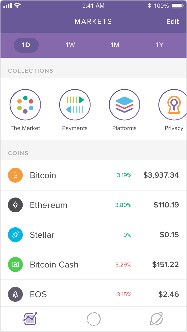
View fullsize Invest-Markets.png
View fullsize Invest-Explore-BAT.png
View fullsize Invest-Widget.png

The only rule is: there are no rules

Crypto doesn't exactly follow a strict set of rules. On the contrary, most are open-source software projects, maintained by a large, distributed group of individuals, often without a central guiding force or parent entity. As such, their level of brand sophistication varies wildly. Some have well-defined identity systems with official, downloadable logo assets, color palettes, and usage guidelines. Others are chaos.
An animated GIF crafted by Circle’s brand creative team

An animated GIF crafted by Circle’s brand creative team

Some assets attempt to look like currency symbols, as though they'd appear in any font alongside $, €, £, and ¢. Some went so far as to co-opt existing Unicode characters. Before Bitcoin was formally added to Unicode in 2017, it was often denoted using the phonetic symbol Ƀ, or more confusingly, ฿, the symbol for Thailand's official currency, the Baht. Some asset symbols are more logo-like, while others (like Dogecoin and Decentraland's MANA) are effectively full-blown illustrations.

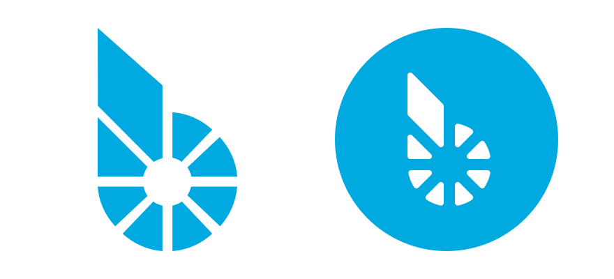
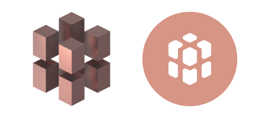
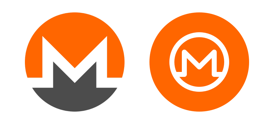
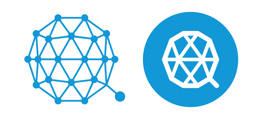
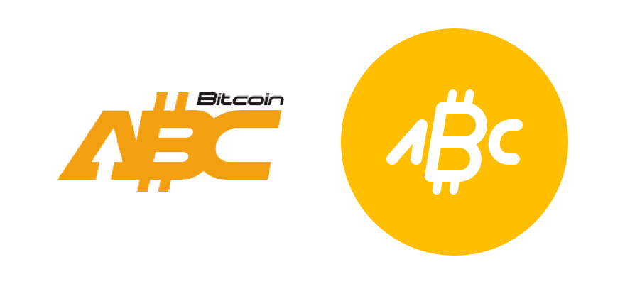
I set out to craft a cohesive set that brought all the logos closer to the "currency symbol" end of the spectrum. The challenge, of course, was balancing consistency with faithfulness to the originals.
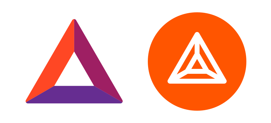
Original-v-set_Basic-Attention-Token.png
Original-v-set_Bitcoin-ABC.png
Original-v-set_Bitcoin-SV.png
Original-v-set_Bitshares.png
Original-v-set_CLAMS.png
Original-v-set_Dogecoin.png
Original-v-set_Factom.png
Original-v-set_Foam.png
Original-v-set_MANA.png
Original-v-set_Monero.png
Original-v-set_Qtum.png
Original-v-set_Tether.png

The icons sit within a 24 × 24px frame and are constructed with a 2px stroke with rounded corners terminals (though in some cases, a finer line was needed to capture the spirit of a logo). These are the same parameters as my "UI Icons" library, ensuring the crypto icons felt at home in Circle's apps. I also produced larger versions for the "Illustrated Icons" library, which were used heavily in Invest's brand and marketing.

Social graphic for Circle’s “Bitcoin bonanza” promotion, featuring my library of crypto asset icons

Social graphic for Circle’s “Bitcoin bonanza” promotion, featuring my library of crypto asset icons

And I didn't stop at the assets already listed in Invest. For legal and security reasons, the knowledge of which assets we'll offer is closely held until shortly before launch. I didn't want to be caught flat-footed, having to turn around a handful of icons on short notice. In addition, I anticipated that we'd eventually bring the icons to Poloniex, which lists dozens and dozens of assets! I set out to build each and every one.

Color

Each asset was also assigned a key color, which sometimes proved even harder than the icon work! While most assets have some form of symbol or logo, official colors are rare. When no guidelines were found, I'd choose a dominant color from the project’s website. I ensured that each would be unique, with no two assets in our set using the exact same color.

Icons - Crypto assets.png

The hues were also chosen with contrast in mind. We wanted to ensure that each icon, rendered in white, would stand out against its key color. We applied the same strict accessibility standard we use on text color, but ran into trouble with lighter asset colors. Shifting dark enough to pass text contrast standards transformed them beyond recognition. This was especially troublesome for Bitcoin, the oldest and most widely-known cryptocurrency. Turning its distinct orange to a rusty brown was unacceptable.

In the end, we applied a less stringent standard. The W3C's visual contrast guidelines specifically exempt logos and logotype:

Stylized text, such as in corporate logos, should be treated in terms of its function on the page, which may or may not warrant including the content in the text alternative.

We never use an icon and color as the sole method of identifying an asset. They are additive, always presented alongside the asset’s name and currency code. Sacrificing contrast for brand precision, in this instance, felt like the appropriate tradeoff.


Always more icons

This project has advanced slowly and sporadically, often in the gaps between more immediate priorities. But with new wallet designs coming soon to the Poloniex web and native apps, the icons are off the back burner. The library is nearly complete—for now, anyway! With new assets being developed and listed all the time, the work is never done.


More Illustration Projects

Featured
Reveille Illustration System

In January 2021, USAA was nearing completion on a new design system and a refresh of their brand voice. They needed help defining how illustration at USAA should look, feel, and function. I crafted an illustration style and system that integrates directly into Reveille and reflects the modernized brand, then trained and led a team of illustrators to expand the library into the future.

Read more →
Illustrations for Circle's 2020 rebrand

In late 2019 and early 2020, Circle sunset, sold, or spun out every one of its consumer products, and dedicated itself to building B2B USDC services. Naturally, it was time for a rebrand! Though I had left the company months before, my friend and former colleague Kristine asked me to once again define the company’s illustrative brand—this time as a freelancer.

Read more →
Circle product & brand illustration

When I joined Circle as a product designer, I was hired, in part, for my background in illustration. But that “nice to have” soon became my central focus. I’ve spent years defining and evolving the Circle illustrative brand, cementing its place in our products, website, marketing campaigns, and more.

Read more →
How to Draw a Startup

How to Draw a Startup is a new personal project of mine, a podcast miniseries about the evolving role of illustration in the tech industry. I spoke with over a dozen illustrators, designers, art directors, educators, and more to understand why illustration is used, how illustrated brands are crafted, and where illustrators fit in creative teams.

Read more →
CENTRE identity and illustrations

Circle was founded on the belief that blockchain technology could usher in a more open and inclusive global economy. But such a future can’t be built within the walls of a private company. It requires open standards and partnerships. That’s why, in 2017, Circle announced CENTRE, a “foundation, open source project, protocol, and network aimed at breaking down the barriers which cost us money and time to connect to each other financially.”

Read more →
Circle UI icon library

With the limitations of a small design team, early versions of Circle Pay primarily relied upon off-the-shelf icon sets. But after I joined and began creating illustrations for product and brand, I soon set my sights on icons. I made a few as needed, but replacing the old set entirely wasn't worth the design and development commitment. But with Circle Invest, I was there from the beginning.

Read more →
Crypto asset icon library

As a financial tech startup, Circle’s apps have always needed to represent currency. Circle Pay got its start as a Bitcoin wallet, and within a couple years added US Dollars, British Pounds, and Euros. Custom icons were made for these four currencies, showing up throughout the app and its marketing.

But Circle Invest called for even more. The app offers _thirteen_ different crypto assets. Presenting these disparate crypto projects in a coherent and consistent way would advance Invest's mission to make crypto more approachable. I set out to create a unified set of crypto icons. Easier said than done…

Read more →
How to move $1M in USDC

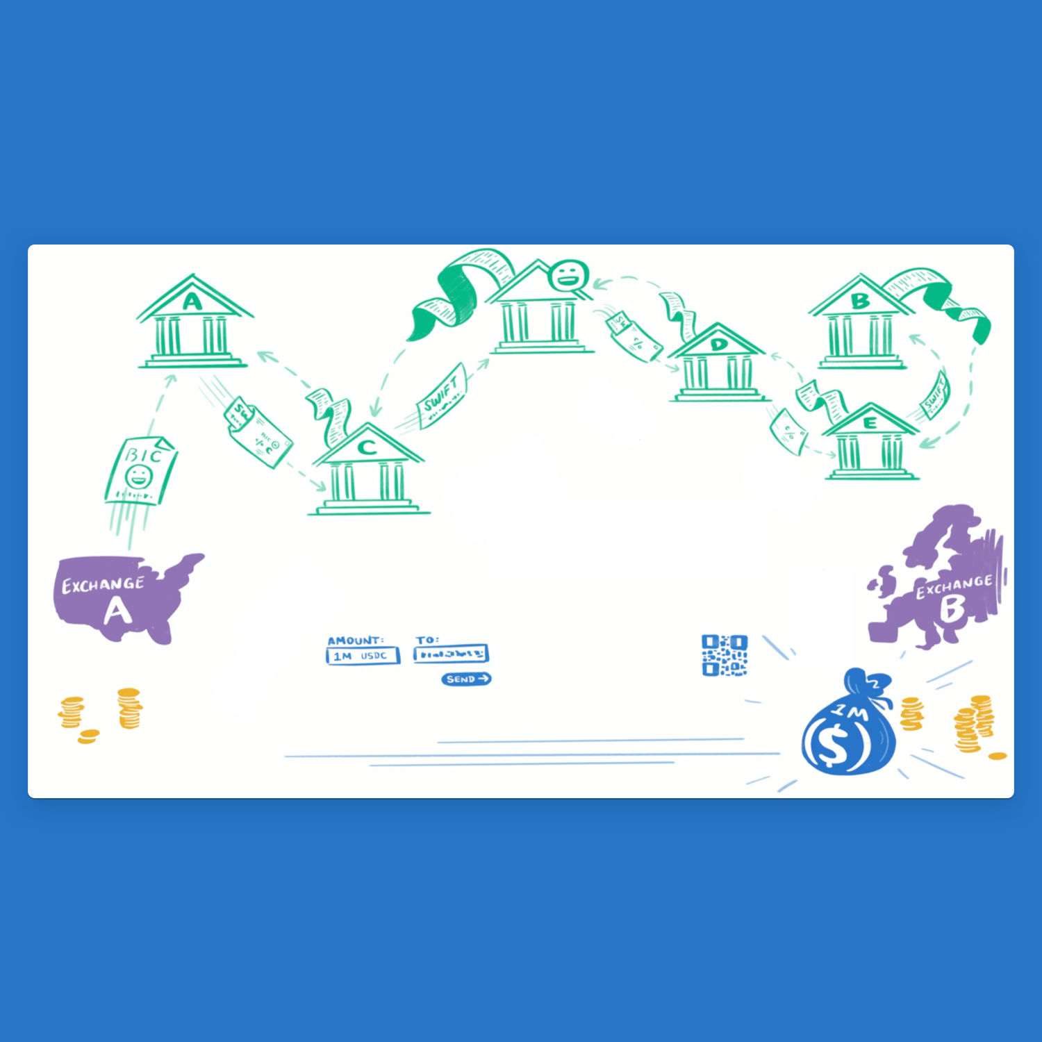
In early 2019, Circle’s chief evangelist Anders Brownworth and I collaborated on an animated educational video. The project's goal was to demonstrate how USD Coin could facilitate fast, low-cost international transfers between exchanges.

Read more →
Circle Invest "Explore" illustrations

Circle Invest isn’t just the best way to buy crypto, it’s the best way to learn about it. The "Explore" section of our app features approachable, informative content to help you develop your understanding of the world of blockchain. For each article, I’ve created a unique editorial illustration.

Read more →
Circle crab wallpapers

In addition to my usual product design and illustration duties at Circle, I have a fun little side project: creating custom wallpapers for my colleagues' phones. Each illustration features a few of our unofficial mascots, a crew of adorable crustaceans. What started as a monthly project has since become quarterly, as I kept getting more and more ambitious. So much for a "side project!"

Read more →
Circle Boston office mural

Circle's Boston team moved into a new office in the summer of 2017. I was excited to produce a mural for our cafe, bringing the spirit of Circle Pay to the central point of our office.

Read more →
Titleist website & icon design

For more than 80 years, Titleist has made “the #1 ball in golf.” The storied company came to Fresh Tilled Soil with a website that had grown too cumbersome; it was inflexible, mobile unfriendly, and in need of a visual and UX overhaul. Our team set out to craft a modern, fully responsive site that captured the brand’s timeless classicism. I worked alongside some of Fresh Tilled Soil's most senior creative talent, and contributed to the project's visual design, conceptual development, wireframing, prototyping, icon design, and more.

Read more →
Rethink Robotics website & icons

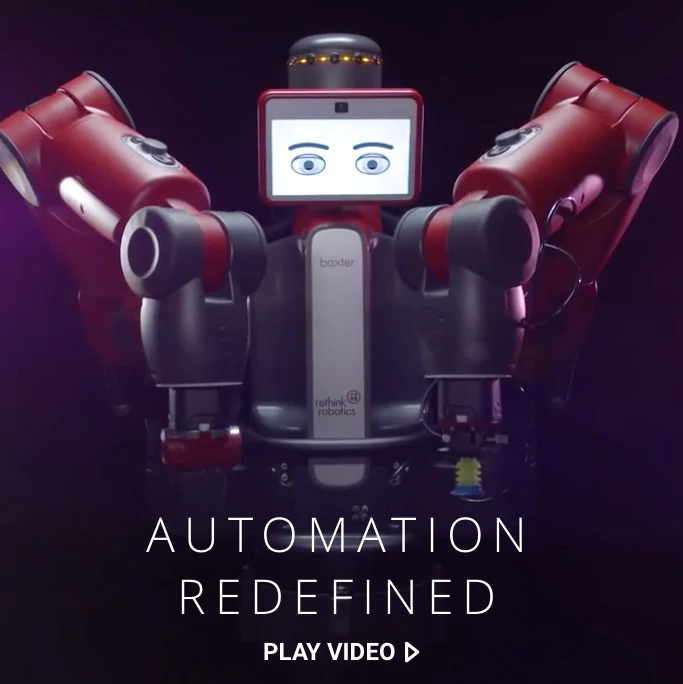
Rethink Robotics makes extraordinary robots for manufacturing and scientific research. At the company’s core is a profound vision of the relationship between humans and robots, and no wonder—co-founder Rodney Brooks is a robotics pioneer. That vision, however, was lost in its website, buried by a complex information architecture and unfocused design. The site Fresh Tilled Soil crafted better illustrates Rethink’s compelling narrative and serves as a flexible platform for their future growth.

Read more →
Incantor mobile game design

The team at MoveableCode saw an opportunity: technology could enable new directions in storytelling and gaming, using the virtual to connect us with our physical world like never before. The result was Incantor, an innovative mobile game that sought to make magic real. Along with my colleagues at Fresh Tilled Soil, I helped to refine and design the game, from its mechanics and mythology to its unique visual language.

Read more →
itsgr82bme pitch illustration

Brooke & Michael Webb built itsgr82bme.com (“it’s great to be me”) to be the central home for family-friendly activities, connecting families and small businesses across the country. They came to me to enhance their investor pitch deck with illustrations, helping to visualize their story and take itsgr82bme to a brighter future.

Read more →
Winter Wonder: IdeaPaint Studio Session

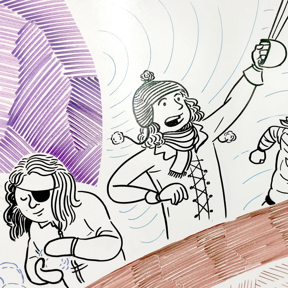
IdeaPaint transforms nearly any surface into a dry erase whiteboard. Naturally, every surface at the company's Boston headquarters is painted with it, creating an office-sized canvas. Every other month, IdeaPaint invites a local artist to create an art installation in their unique space, covering hundreds of square feet with just dry erase markers. I love a good challenge, and couldn't turn down an invitation to be their December 2014 Studio Session artist.

Read more →
UX Fest
UX Fest

On October 1, 2013, Fresh Tilled Soil held its first annual UX Fest. The event brought together Boston's UX community to explore how every aspect of a business–from design and technology to marketing and strategy–contributes to the user experience. The event was a success, and a year later, we held an encore. I’m proud to have helped conceive of and organize these events, contributed to the creative collateral, and led sessions.

Read more →
Digital Design Leader portraits for Fold

After nearly ten years of working in the fast paced, ephemeral realm of online experiences, we at Fresh Tilled Soil decided to stop, think, and get some ink on our hands. The result was Fold, the company's first-ever print publication. In addition to design and editorial contributions, I illustrated nine portraits for a feature story on leadership in the digital design industry.

Read more →
Manifesto & Travel Series lettering

After several years of stewarding the To Boldly Fold brand and visual identity, I was thrilled to contribute to the design of our leather-bound books for the first time. The results were the Manifesto Series and Travel Series, two collections of handsome sketchbooks and journals.

Read more →
Goody bag lettering
Goody bag lettering

To Boldly Fold isn't all leather sketchbooks and journals. Our line of hand-lettered goody bags bring a bit of whimsy and artistry to an everyday experience.

Read more →

Tags: Circle, crypto, icon design, iconography, logo, product design, experience design, branding, marketing, color, accessibility, identity, UI design, illustration, vector, UX

Halloween 2017: LEGO Batman
Intel gesture-control prototype