Though I joined Circle in 2016 as a product designer, I was hired, in part, for my background in illustration. What began as the occasional graphic grew to become a major responsibility, and by mid-2018, icons and illustrations commanded the vast majority of my time. Along the way, I've defined and evolved the Circle illustrative brand, giving it a prominent home within our products, website, marketing campaigns, and more.
First steps
I came to Circle right in the middle of iOS beta season. iOS 10 would launch in the fall, and with it, Circle Pay would introduce an iMessage app, which would enable iPhone users to send cash directly within their text conversations. The money message could include a graphic—that's where I came in.
I illustrated a happy, anthropomorphic coin, strolling along and whistling a happy tune. By personifying your money—it was excited to go on a little journey!—I hoped to make the experience feel less transactional. It was a match for Circle Pay's irreverent and social brand.
Of course, seeing the same graphic over and over could get dry. If the feature succeeded, we would expand with a whole series of illustrations. Unfortunately, iMessage apps never really took off, and we stuck to the one. Still, I love these sketches!
Speaking of sketches: Before landing on anthropomorphized money, I explored a number of concepts. The sketches below foreshadowed several themes that would ultimately form the core of Circle Pay's illustrative brand: transactional metaphors, animals (and what they value), and the depiction of people.


Illustrated icons
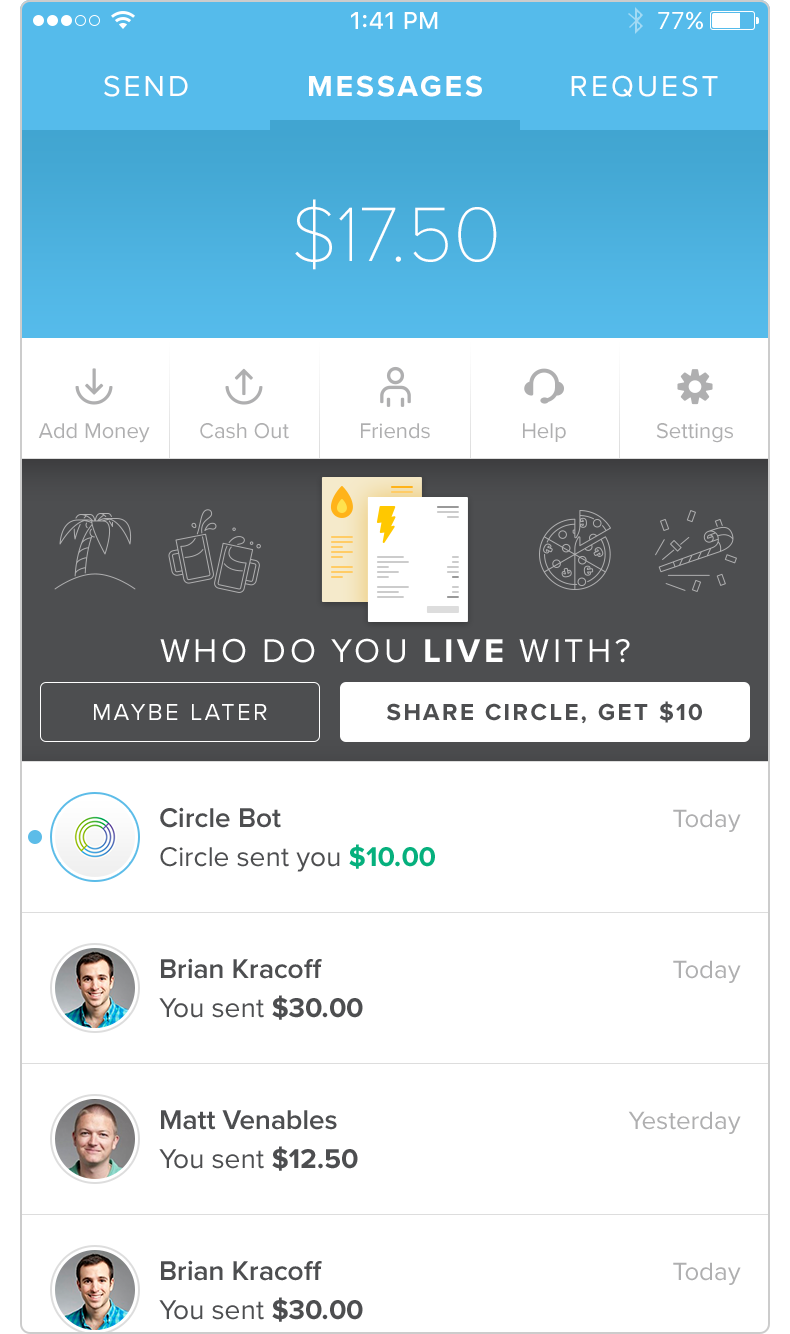
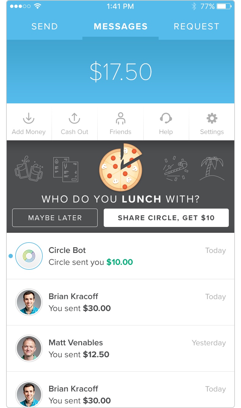
Prior to my arrival at Circle, the company used a small set of "pinline" style icons in its product and marketing. The brand team asked that I expand the set to highlight Circle Pay's strongest use cases and benefits.
I refined the style and created dozens of new icons. This library of "illustrated icons" became an ongoing project, growing steadily as we introduced new features and products.
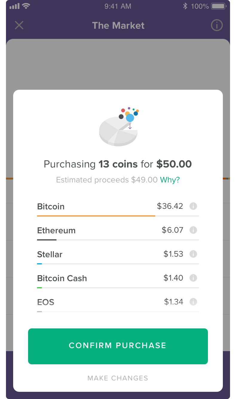
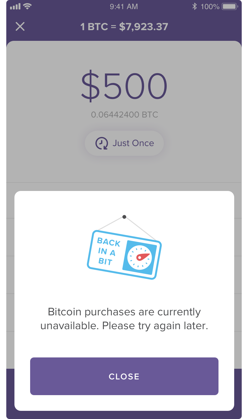
The library covers a wide range of contexts and emotional expressions. Straightforward or negative situations utilize clean, clear graphics with literal interpretations, while exciting or congratulatory contexts call for more energy, whimsy, and metaphor.
I also introduced two new styles: full color and tonal, a semi-transparent treatment that excels over fields of color. With most icons available in all three styles, the set is incredibly versatile.


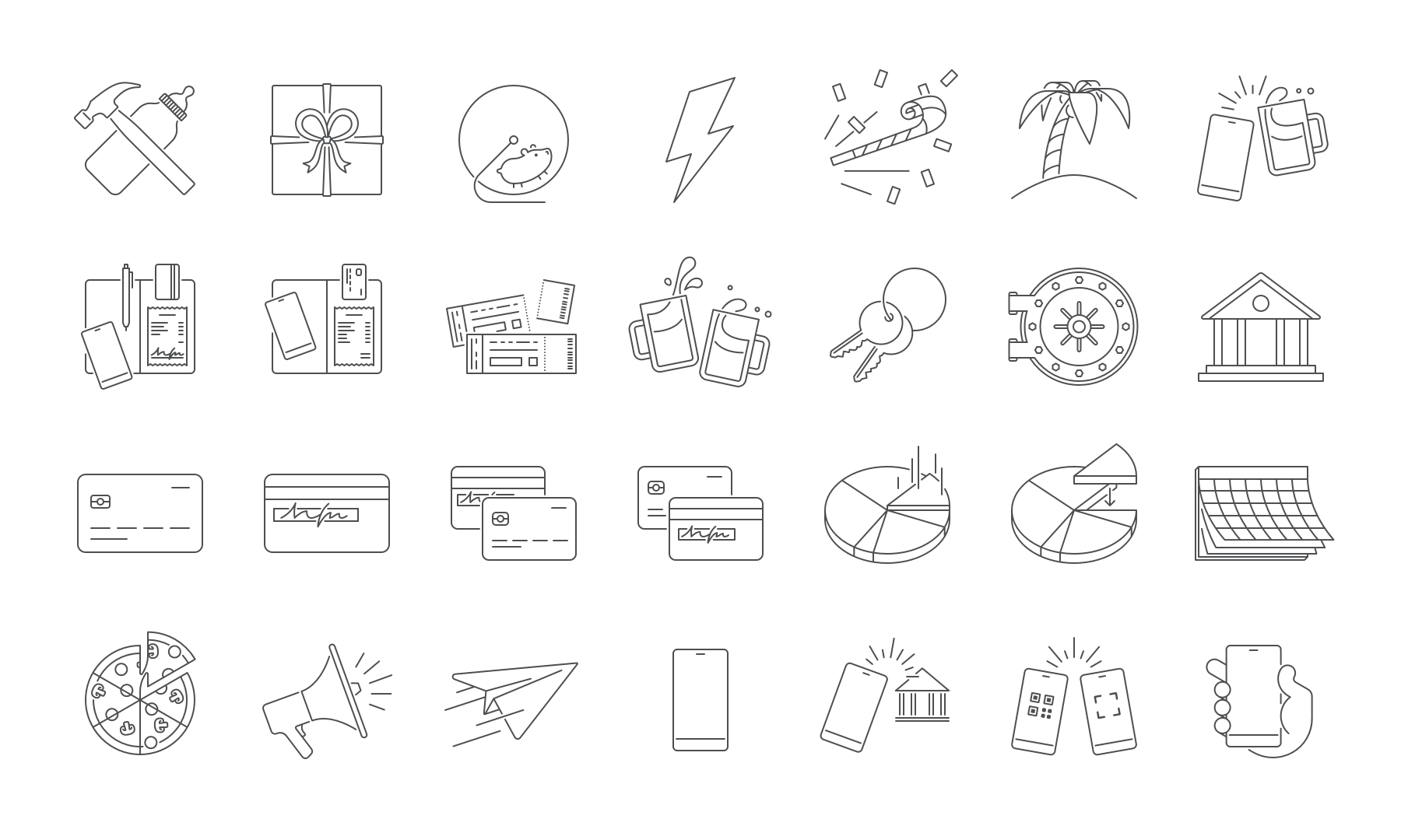
These illustrated icons are now a central part of the Circle visual identity. They've appeared in every Circle product, the company website, countless marketing campaigns, customer referral programs, transactional emails, key product flows, and even company swag—t-shirts, keychains, onesies, and yes, socks.


Money, animals, and people
Soon after creating the iMessage app, we spruced up Circle Pay's first run experience. A number of folks would download the app but never sign up or sign in.
Users download apps for all sorts of reasons. Some are super well informed, choosing us after careful, targeted research. Others scan an article, click a friend's social post, or just browse the App Store. They don't always know or remember why they have the app.
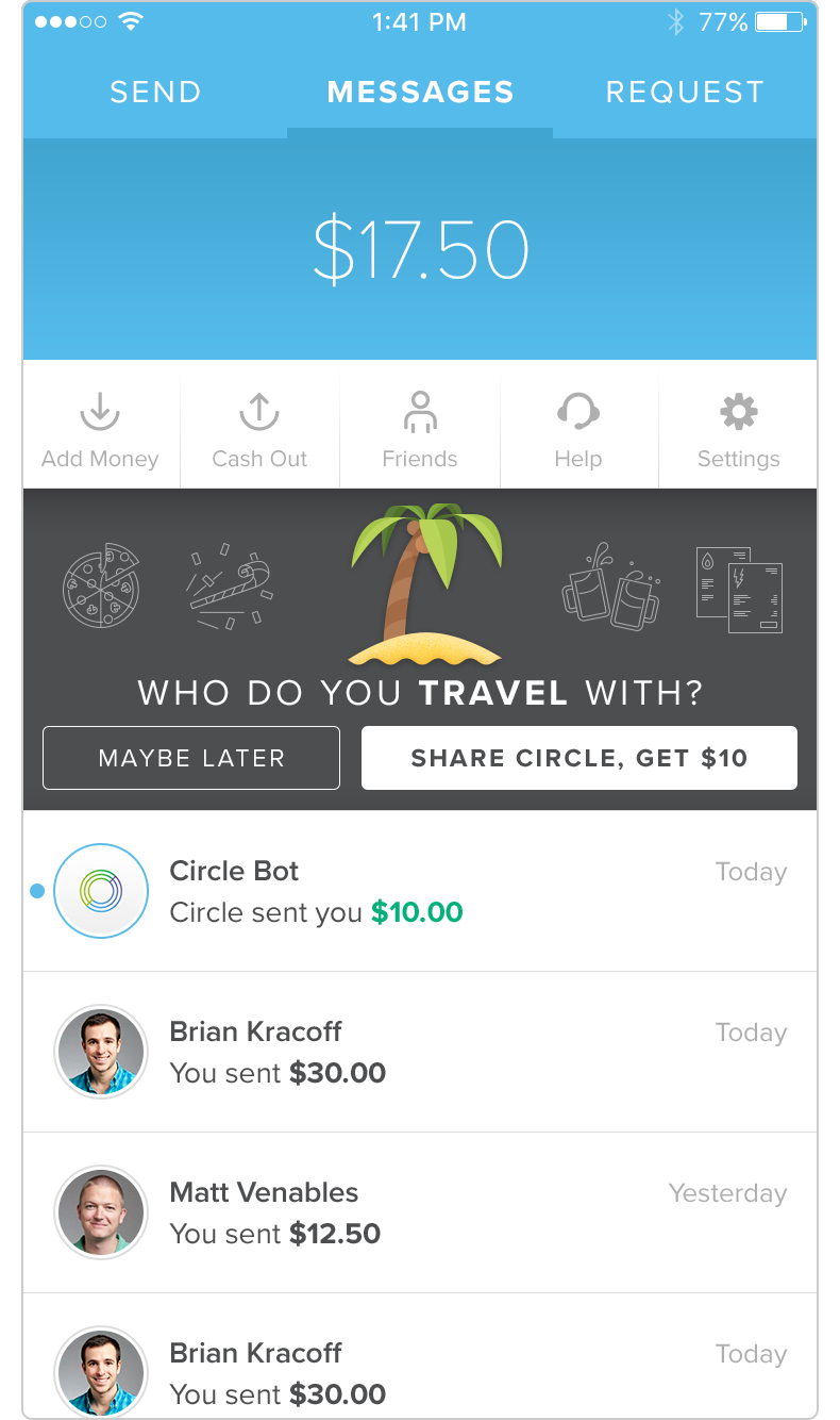
We wanted all users, regardless of their point of entry, to understand the app's key features and benefits. This illustrated carousel was the solution:

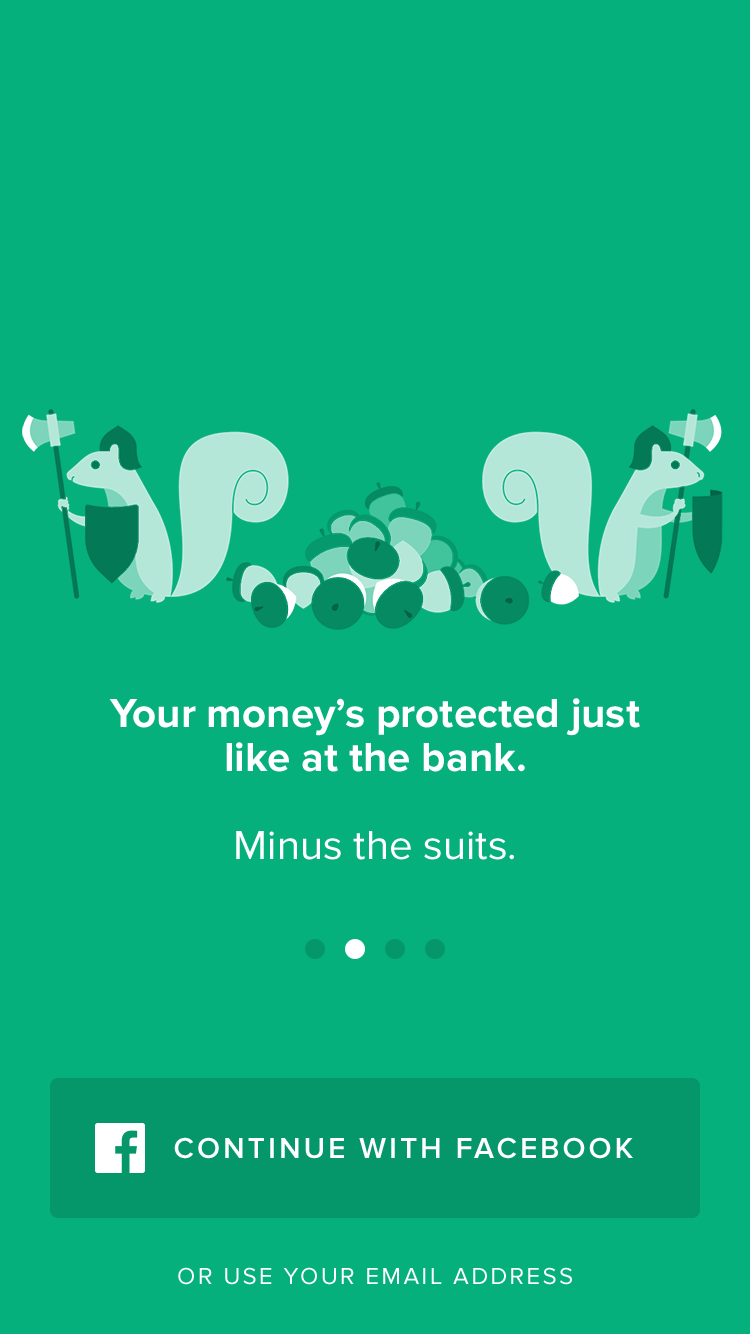
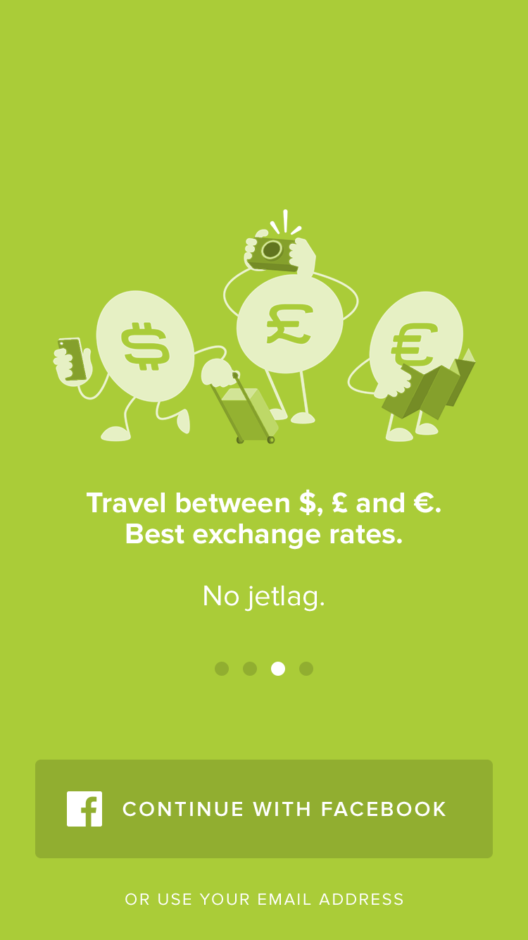
This project was a critical point in defining Circle Pay’s illustrative aesthetic. It established how I’d portray people and animals and clarified how we’d apply each type of character. Animals communicated general benefits, coin characters personified how Pay would benefit one's money, and people demonstrated real world use cases.
These styles were tested in earnest a few months later when we needed a short video for social media marketing. We worked with an independent animator named Alex Creed to bring the aesthetic to life. I produced storyboards and collaborated closely with Alex, ensuring the animation captured the unwritten subtleties of the style I was establishing.
Empty states
What does an empty inbox look like? A transaction list with no transactions? Empty states, often seen on an app's first run, are an opportunity to establish the app's tone, communicate the page's purpose, and guide users to action.


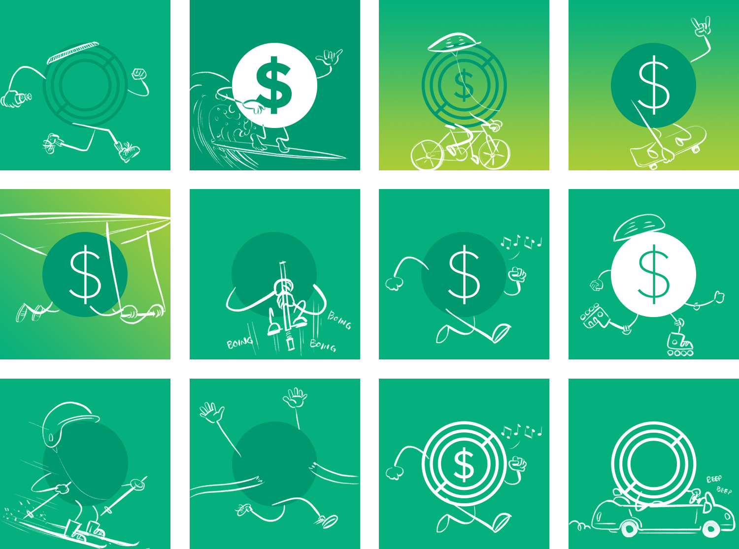
For the "Messages" list, I created a scene of money characters with walking and biking with friendly messages in tow. It establishes that Pay enables social payments.
The "Transactions" screen, meanwhile, shows an accountant, keeping track of himself and his financial friends.
Lastly, "Friends" depicts a rabbit and a raccoon trading their packed lunches. The rabbit is tired of all those healthy veggies, and the raccoon needs a cleanse from its usual stream of literal junk food. The message: Circle’s better with friends!
Growth experiments

The theme of that last illustration came up again and again. After all, like any social application, Pay is only worthwhile if your friends and family use it as well.
We frequently ran experiments around referrals and growth, trying to determine the right mix of incentives to encourage users to share Pay with their network. One test, known as "Invite Tokens," enabled users to send $5 to three friends, on us! Upon launching the app, three of our crab characters animated in, each catching a $5 coin.
Invite Tokens didn't work out (people were more motivated to share when it would benefit them directly), but I'm still fond of the illustration! I created this animated mockup in Keynote to convey timing and positioning to our app developers.
User avatars
Though setting a custom avatar made Pay users and their friends more engaged, some folks simply couldn’t or wouldn’t. These users would get the “mystery man,” a simple, boring, and vaguely male human silhouette. Realistically, this meant most users' "Messages" and "Friends" screens were full of boring gray pawns.
I set out to craft a whole set of defaults. They had to strike a careful balance: colorful and fun enough to spruce up those repetitive list views, but not so good that folks actively chose to use the defaults and never upload an image of their own.
I thought back to my early sketches, the "Friends" empty state, and the squirrels guarding their acorns. To squirrels, the acorns were currency. To rabbits, carrots. What would other animals find valuable?
I illustrated a set of animals, each holding something they consider valuable. Each was available in four color variants for a total of twelve avatars. The animals were simple silhouettes, the colors low contrast, resulting in a certain ghostly quality. They were charming but ephemeral, a temporary option before uploading your own custom image.
Circle.com
Illustration has also played an important role on Circle.com. In early 2018, Circle Pay's page featured three large graphics: one depicting Pay’s group payments feature, another expressing its powerful network effects, and a third highlighting instant cash outs.


Early 2018 was also a time of major transition. Over just a few months we launched Circle Invest, acquired Poloniex, and elevated our crypto trading desk's public persona. We went from a one product company to a four product company—seemingly overnight.
In a redesign of Circle.com, the brand team sought to present Pay, Invest, Poloniex, and Trade as a cohesive product line. They asked that I produce a supporting graphic.
This was new territory. To date, the Pay brand and Circle corporate brand had been inextricably linked. But Pay’s playful, social personality had no place in Trade or Poloniex. These were vastly different product lines for vastly different users. What role would illustration play in the Circle corporate brand?

The final image, which was displayed prominently at the bottom of each product page, took its cues from the pinline illustrated icons. These images had already proven tonally flexible, expressing everything from silly to serious. Paired with our brand colors, they felt distinctly Circle.
Before landing on line, though, I explored a number of visual treatments.


Circle Invest
Circle Invest began fairly illustration-free. In its earliest days, we weren't certain of the app's brand, its place in the market. We explored some illustrative treatments for the first launch experience, but ultimately went with a simpler approach.
But as we grew more confident with Invest's voice, the app began to fill with illustrated icons, UI icons, custom crypto asset symbols, and editorial illustrations.
We also used a full-screen graphic to encourage referrals. Playing off a popular crypto meme—TO THE MOON!—the illustrated starscape evokes a sense of wonder, optimism for crypto's future, and Invest's breadth of available assets.
Poloniex
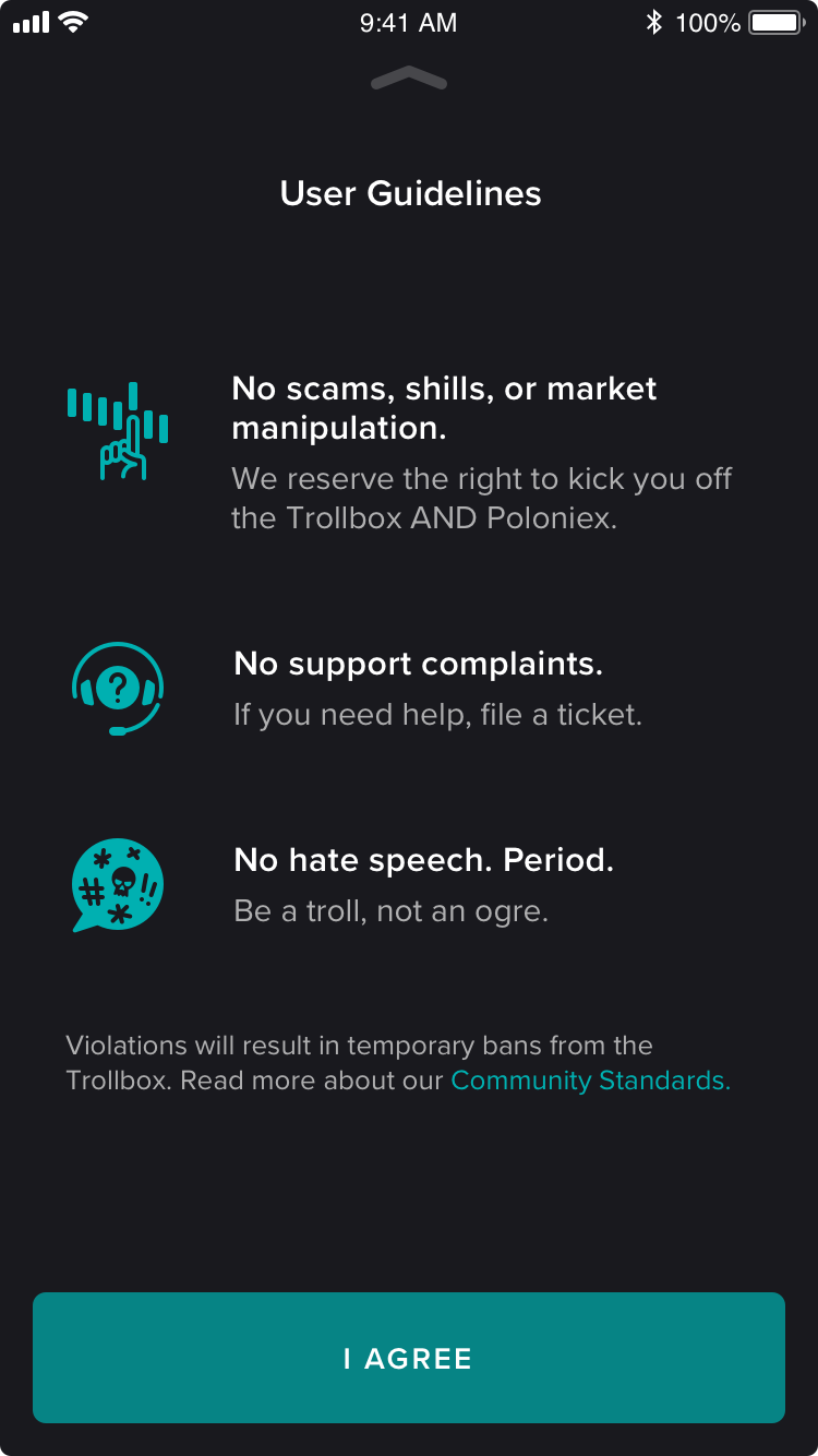
Since Circle's acquisition of the crypto exchange Poloniex in early 2018, we've focused on strengthening core infrastructure and modernizing the user experience. This has meant a light touch when it comes to brand, but an opportunity to illustrate came with the relaunch of the Trollbox.
The Trollbox was a beloved part of Poloniex history, a lively, often raucus chat room that lived right on the exchange page. Unfortunately, heavy demand on customer support and moderation staff led Poloniex to shut it down in mid-2017.
Our recent (beta) revival of the 'box called for graphics to celebrate the moment and lay down the rules. With the Poloniex brand personality and illustrative style yet to be defined, I took a conservative approach, relying on a simple metaphor—a chat bubble made of crypto assets in circles—and established Circle styles. As we continue to develop the product's brand strategy, I look forward to the opportunity to define a bolder, more uniquely Poloniex illustrative style.

The opportunity to create
In just a few short years, illustration has become a central piece of Circle’s corporate and product identities. It has humanized financial technology, brought features and benefits to life, crafted a unified visual language across products and brand, and forged a more emotional bond with our customers.
I consider myself extraordinarily lucky to have emerged with an illustration degree, design skills, and a passion for Apple technology precisely when the combination of the three would catalyze a boom in tech-focused illustration. I’m thankful that I’ve been able to participate through my work at Circle. I’ve learned so much on the job, and of course, through the production of How to Draw a Startup. Admittedly, that’s a big reason I created the show: to solicit advice from the trailblazing illustrators and designers who made my role possible. I am excited to continue learning, growing, and creating.
Of course, I owe a ton to my fellow designers on Circle's brand and product teams over the years. I couldn't have asked for better advocates and creative collaborators. Cheers to Alie Brown, Alessandro Caire, Jeff Fagan, Kristine MacAulay, Tay Marvin, Jess Nutting, Erin O'Donnell, Nat Tarbox, David Tetrault, and Mimi Weber!


