When I joined Circle as its third product designer, the company's single product, Circle Pay, was available on iOS, Android, and the web. With my arrival, each designer could focus on a single platform. In my case, that meant our oldest app, Circle Pay for web.
As I tackled the design of new features, I also sought to untangle inconsistencies, improve our internal design and development workflows, and build a solid, scalable foundation for the app’s future.

Web app features
During my year and a half leading Pay Web, I designed several new features and improvements, a handful of which I've highlighted below.
Threaded Messaging
The first was a fundamental inversion of our app's core experience: threaded messaging. Prior to threads, Circle Pay was organized as a list of transactions with messages attached. Threading flipped the model, centering the app around conversations with money attached. Effectively, Pay became a messaging app, complete with a chat interface.
We launched this overhaul across our iOS, Android, and web apps simultaneously. I collaborated closely with my fellow product designers, Jeff Fagan and Nat Tarbox, to ensure a cohesive multi-platform experience.


"Sign In" Carousel
When we introduced Facebook as a login option, I adapted the illustrated, color-shifting feature carousel from our native apps to the web.
(For more about the carousel, see my case study on illustration at Circle)


Events
Our experimental “Events” feature enabled users to create a simple web page to collect payments. The feature was particularly popular among student organizations at colleges and universities, who used it to sell event tickets and collect club dues.

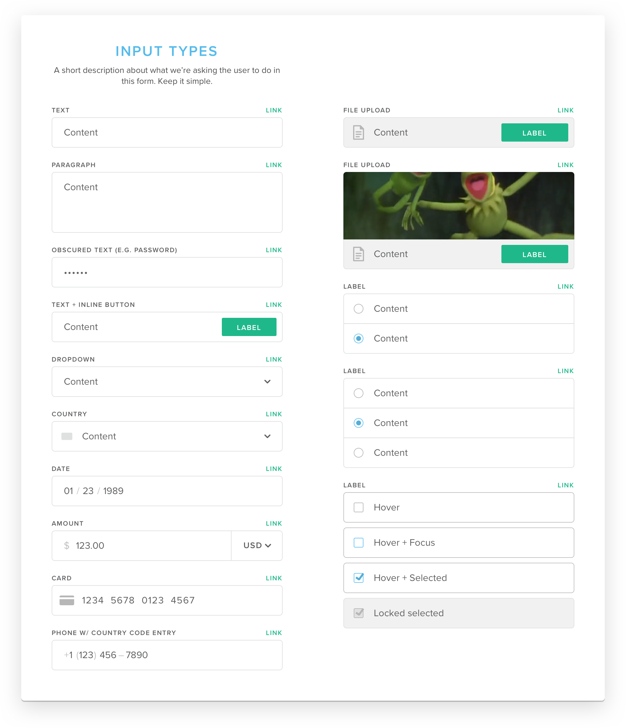
If your mockups don’t involve at least one muppet, what are you even doing?
Modern tools & processes
Prior to my involvement, Pay was designed exclusively in Photoshop. As the only designer on Pay Web, I was free to migrate the work to my tool of choice: Sketch. Of course, this was’t just about personal preference. Sketch empowered us to reduce visual inconsistencies and build a more scalable design and development process.
I rebuilt everything with reusable styles and symbols and regularly incorporated new Sketch capabilities (such as libraries). I adopted Craft Sync and onboarded our web developers to InVision Inspect. I built a manual version control workflow, numbering and archiving versions of my Sketch document while regularly publishing release notes to a shared Google Doc.
Unification
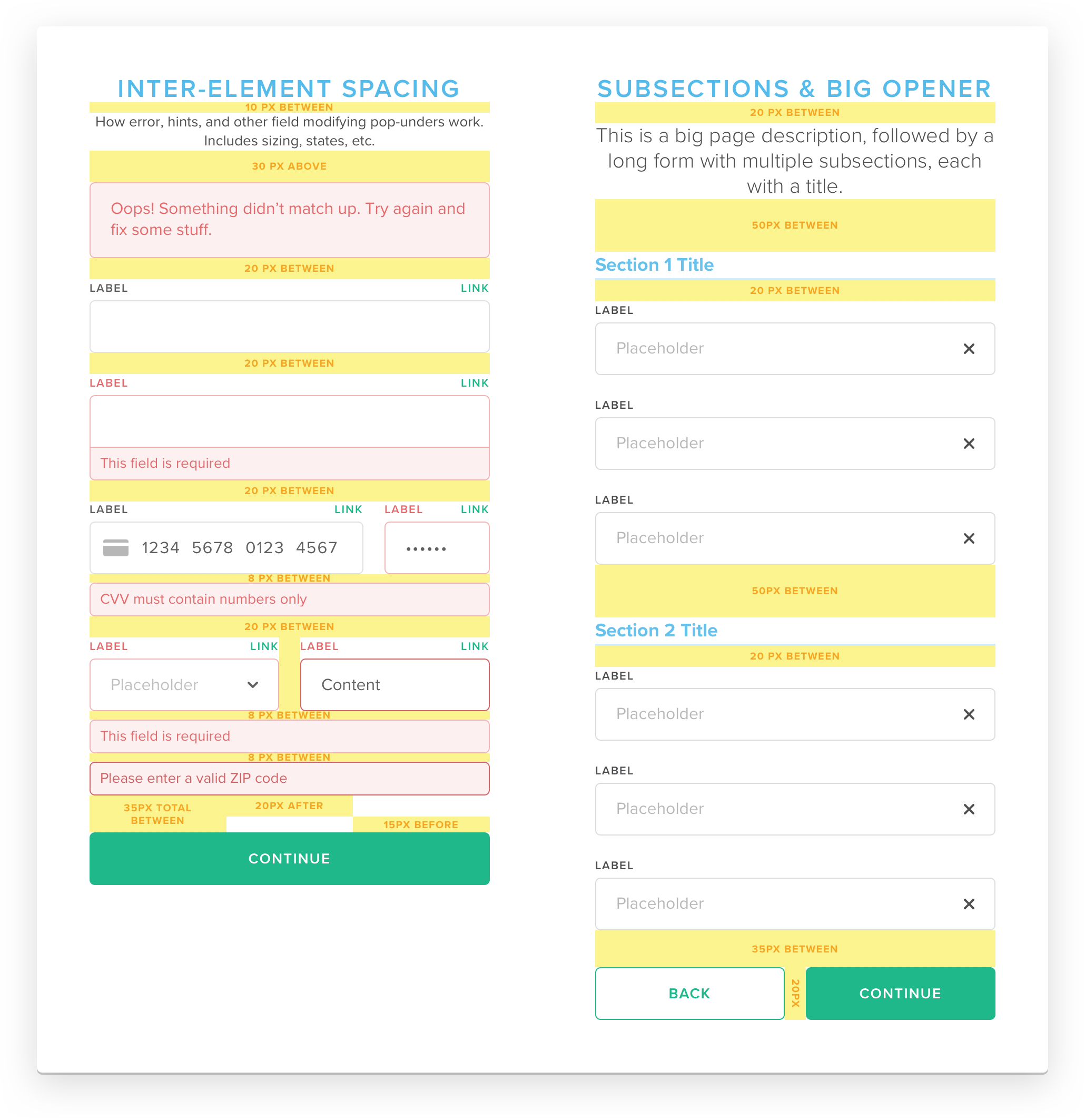
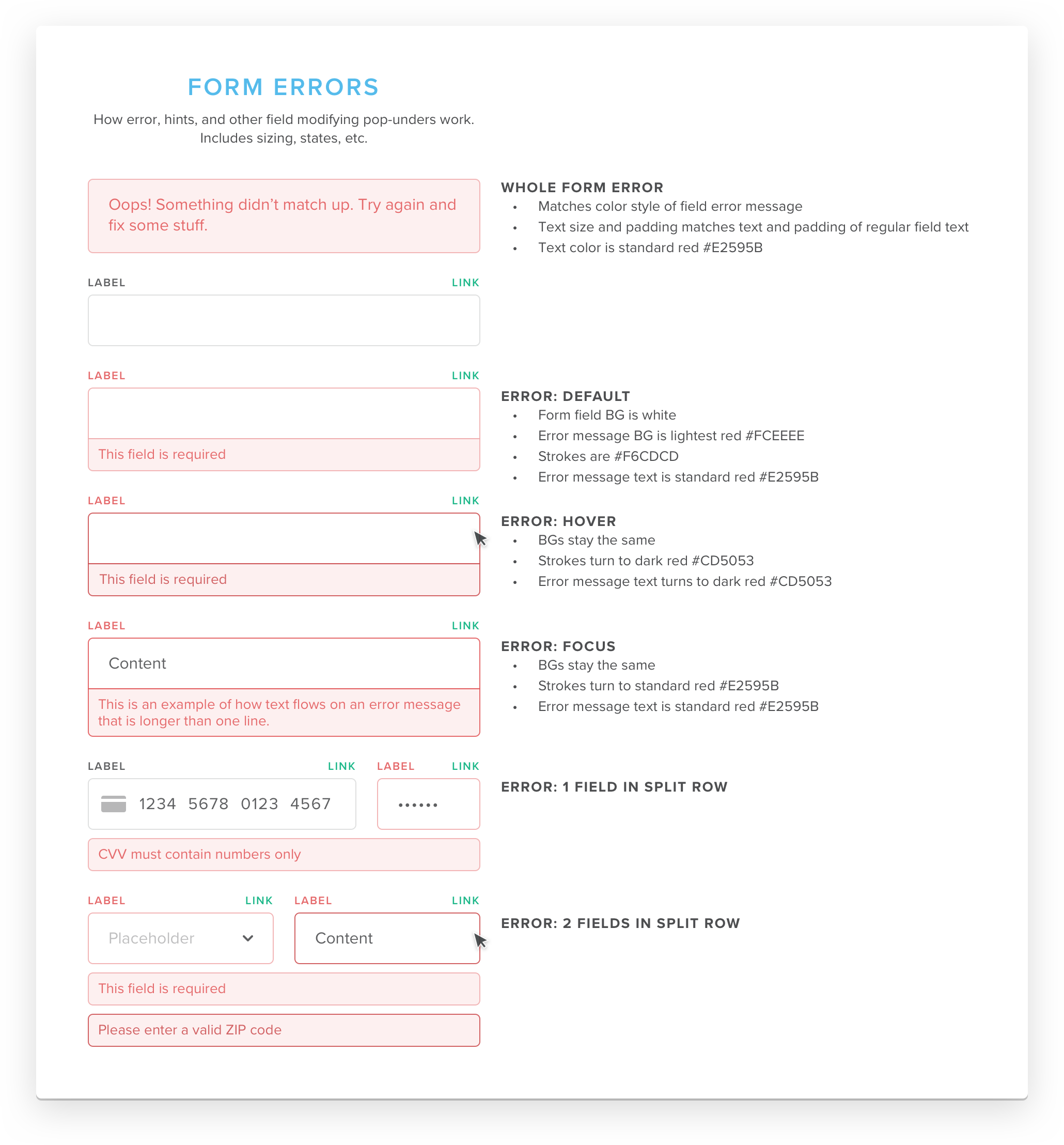
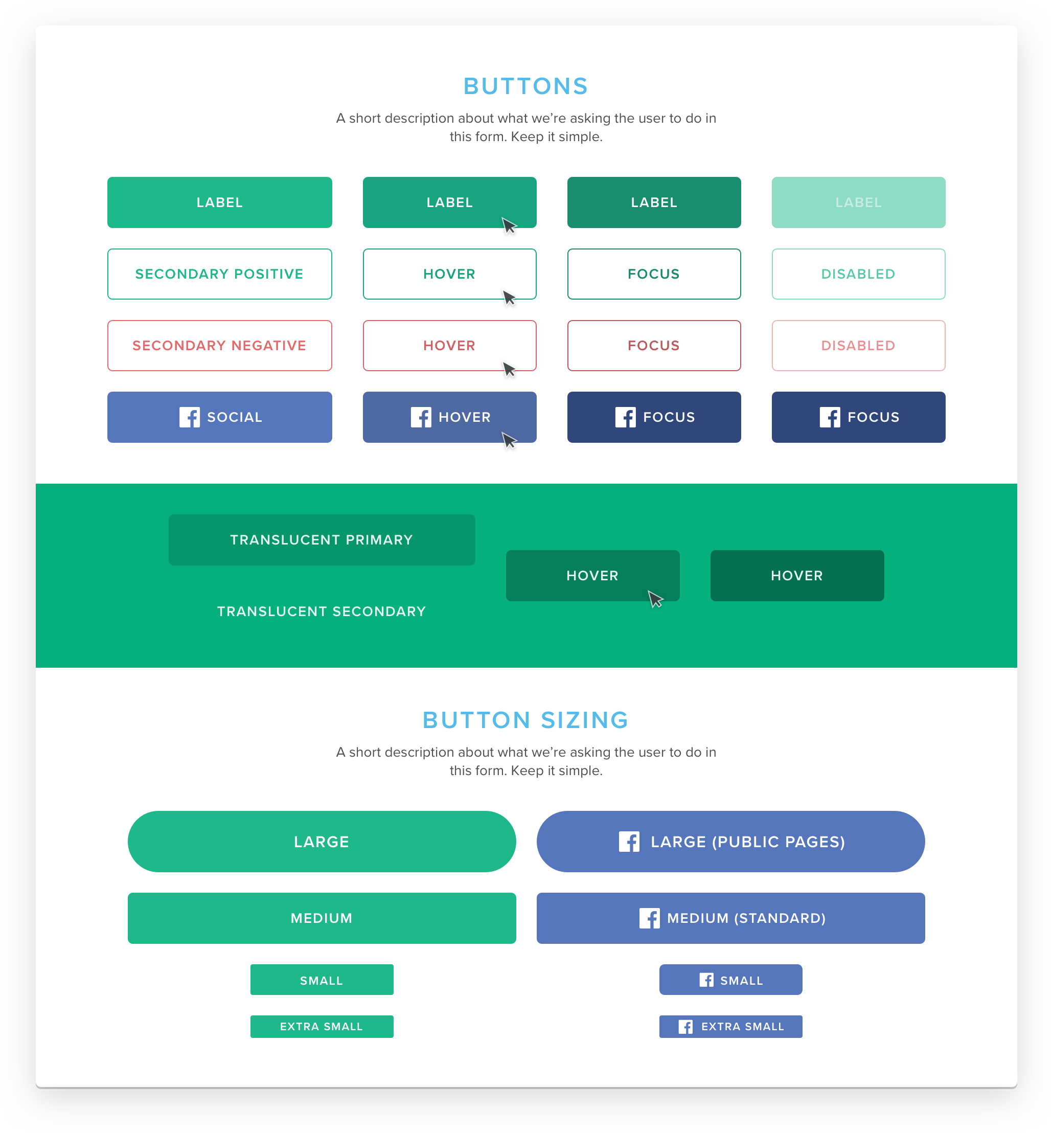
The rapid pace of iteration in Circle Pay’s early years had resulted in a familiar kind of cruft: a proliferation of slightly varied button styles, form elements, text styles, etc. I sought to rein this in with a unified pattern library and style guide, improving both the user experience and our internal processes.
The work began on Pay's “Send Money” flow. I created a new, standardized set of symbols for HTML form elements, buttons, navigation, and more.
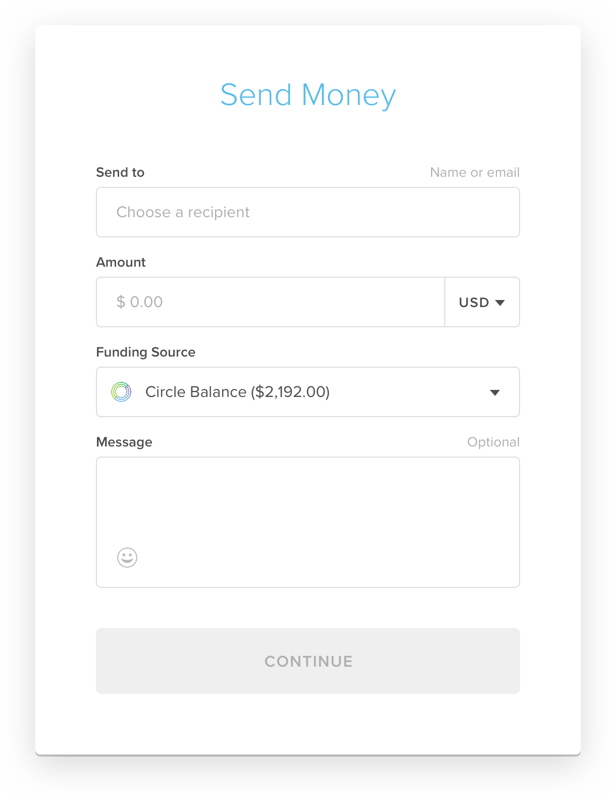


Ideally, the new styles would have then quickly propagated across the app’s many user flows, but in reality, progress was slow. Due to technical and resource limitations, new components could only ship one page at a time. This risked exacerbating the very inconsistency I was trying to address, so I kept my designs conservative. The new styles were simpler and more consistent, but only subtly so, ensuring they didn’t look too out of place alongside older, untouched pages.
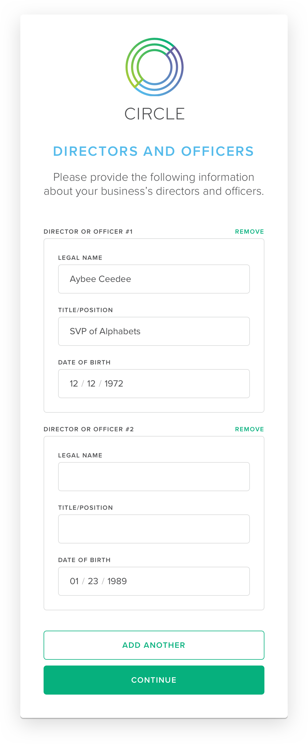
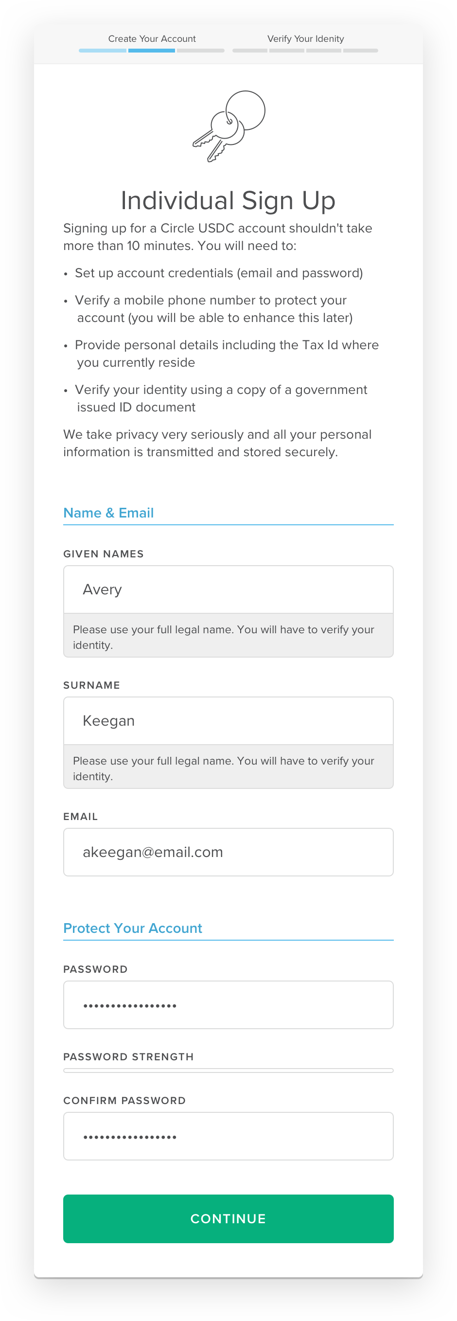
Sign up for the future
Over time, Pay Web fell in Circle’s priority list, and it seemed the app would never receive a full facelift. But in late 2017, an opportunity came to rebuild a major feature: the sign up flow.
Because the sign up flow was naturally siloed from the rest of the application, we had the latitude to stray further from Pay’s traditional look and feel. Though the UX remained largely untouched, I was able to take the visuals to a cleaner, more focused aesthetic—a vision for Circle's future web apps.


Legacy & lessons learned
This project was one of the last major efforts on Pay Web, and Circle Pay will discontinue entirely in late 2019. Still, the visuals and systems established by the sign up redesign live on.
Pay's reusable components, style guide, and pattern library formed the basis of Circle Invest’s lightweight web app, Circle Trade's institutional customer onboarding flow, and Circle's web app for tokenizing and redeeming USD Coin. Most recently, they've served as the starting point for a new Poloniex design system.


Pay's legacy can also be seen in our internal processes. The practices the web team and I established during that era have since shaped the entire product design and development toolset and methodology.
The product design team doubled in 2018, bringing aboard more Sketch-first designers. It was time to move everything out of Photoshop. As resident Sketch expert, I developed a curriculum and led classes, teaching Circle’s product designers and developers how to use the software. I advocated for the adoption of real version control, and led our migration to Abstract. I established (and now actively maintain) best practices for the naming and organization of projects, symbols, styles, libraries, etc. As the tools evolve, I continuously adapt my curriculum, teach workshops, provide technical support, and evaluate new tools and processes.
On a personal level, my years-long mission to ensure consistency, build scalable systems, and foster effective collaboration between designers and developers has been enormously instructive. None of these efforts are ever done; they require constant attention, self-reflection, and adaptation. I am as eager as ever to learn and improve.