Circle was founded on the belief that blockchain technology could usher in a more open and inclusive global economy. But such a future can’t be built within the walls of a private company. It requires open standards and partnerships. That’s why, in 2017, Circle announced CENTRE.
CENTRE (a recursive acronym for ”CENT Routing Exchange”) was envisioned as “a foundation, open source project, protocol, and network aimed at breaking down the barriers which cost us money and time to connect to each other financially.”
Circle’s creative team defined the CENTRE brand, designed its visual identity, and crafted its website and other collateral. I contributed to initial explorations, created illustrations for the white paper, and designed the CENTRE logomark.
Visualizing the brand
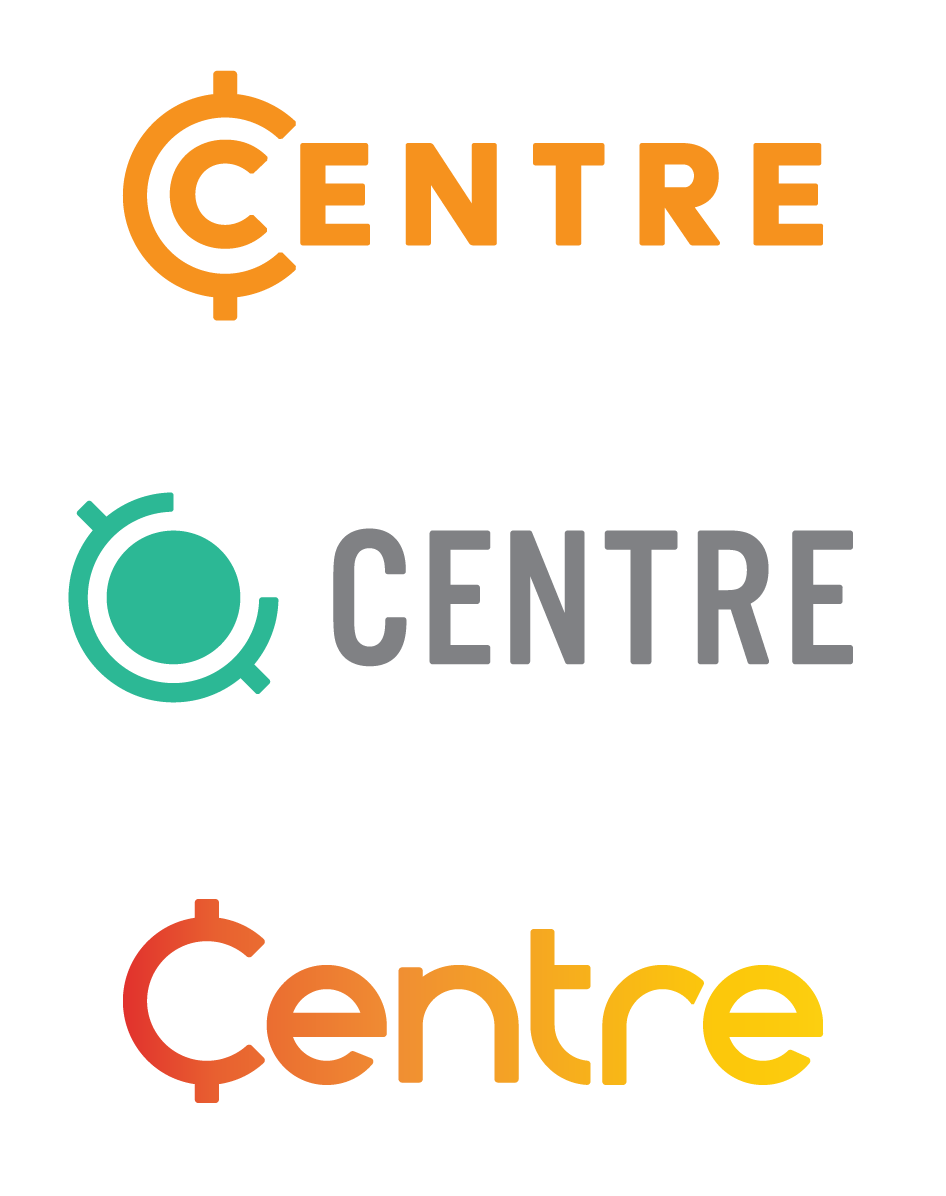
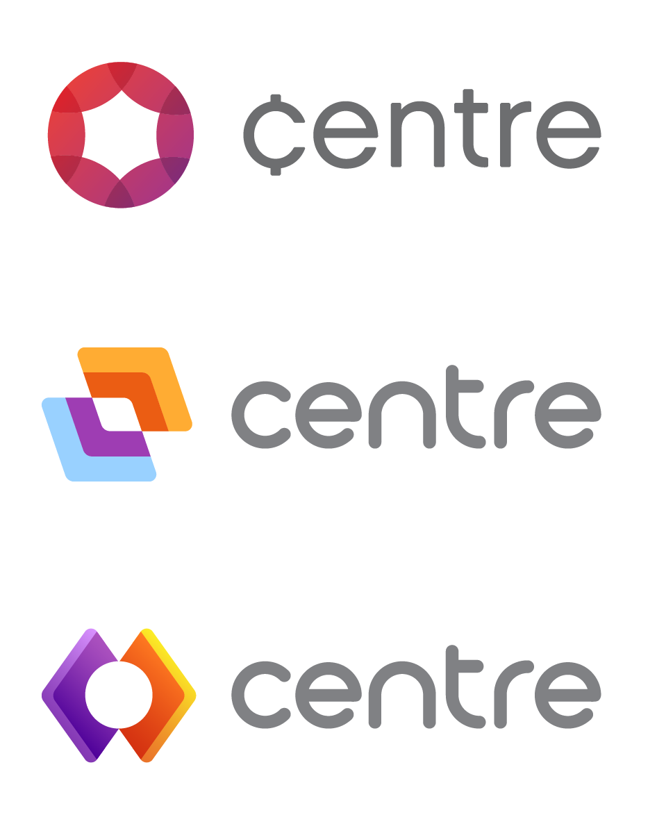
I pursued imagery that expressed openness, collaboration, and CENTRE’s role at the intersection of traditional fiat currency and modern crypto assets. One direction was to embody a “universal currency,” as early CENTRE plans involved a sort of intermediary exchange asset called the “CENT.” I tilted a traditional “¢” symbol to resemble a globe on its axis, mindful that a 45° angle would playfully nod to Circle's own logo.
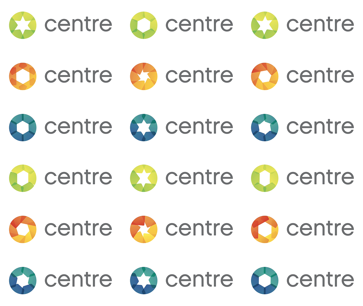
I also pursued a kaleidoscopic approach, with translucent, overlapping shapes that subtly animated. They captured the sense of fluidity and cooperation, but were too complex. I was aiming for a simple, graphic mark, because while the initial audience would be industry insiders, I imagined the brand’s long-term B2C potential. If CENTRE succeeded, perhaps its logo might one day become as familiar as the Visa or Mastercard marks.
The final logomark
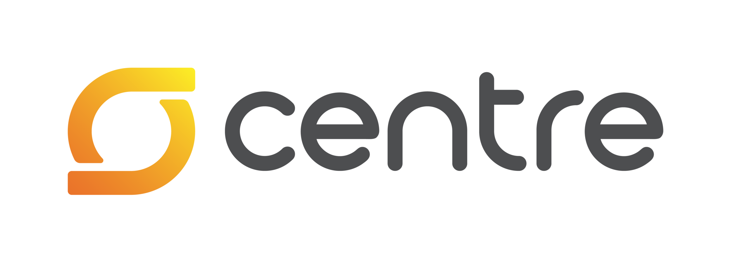
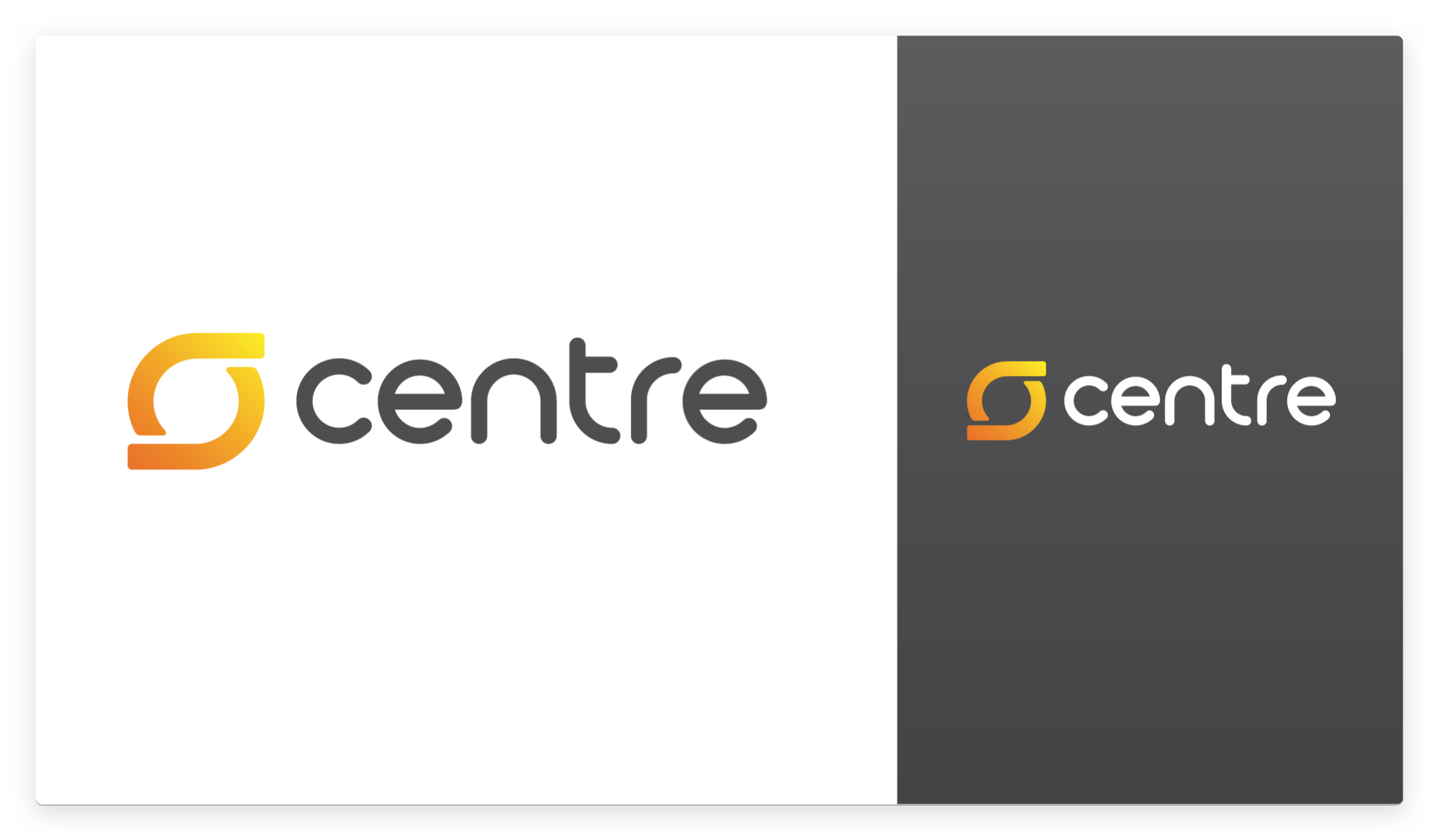
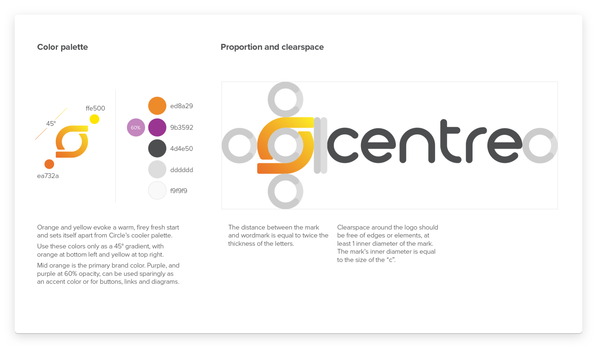
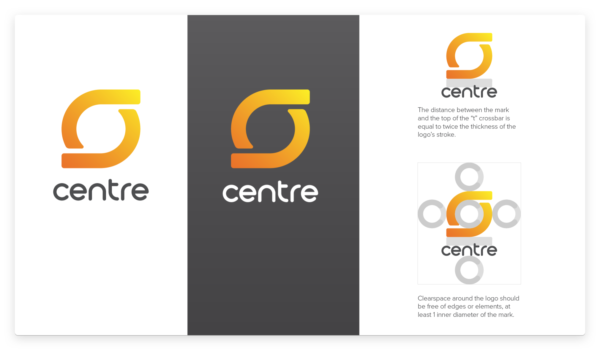
The final logo strikes a simple silhouette, evocative of a simple handshake. I also see a rotary: a free-flowing, circular intersection where value and data enter, interact, and exit without stopping. The primary orange (a nod to Bitcoin, the first “digital gold”) fades into bright yellow, and is paired with a deep magenta. The contrast of brilliant gold against a rich jewel tone reminded me of a sunrise, a new dawn.
I may have designed the final logomark, but the whole process was highly collaborative, with all of us responding to and drawing inspiration from each other’s work. In fact, my final mark was drawn in direct response to a fantastic concept by Alessandro Caire, who also crafted the custom type.
Illustrations
The spot illustrations peppered throughout the white paper were meant to feel vaguely diagrammatic, visualizing the spirit of technical concepts without attempting to directly explain them. These illustrations helped establish CENTRE’s core aesthetic, their influence apparent in countless patterns and icons.
One year later, CENTRE’s vision and technology were brought to life. The hugely successful USD Coin was launched in September 2018, and just a month later, Coinbase joined Circle to co-found the CENTRE Consortium.
I'm proud to have played a role in that launch as well, but that, suffice to say, is a whole 'nother story.
In late 2019 and early 2020, Circlesunset, sold, or spun out every one of its consumer products, and dedicated itself to building B2B USDC services. Naturally, it was time for a rebrand! Though I had left the company months before, my friend and former colleague Kristine asked me to once again define the company’s illustrative brand—this time as a freelancer.
When I joined Circle as a product designer, I was hired, in part, for my background in illustration. But that “nice to have” soon became my central focus. I’ve spent years defining and evolving the Circle illustrative brand, cementing its place in our products, website, marketing campaigns, and more.
How to Draw a Startup is a new personal project of mine, a podcast miniseries about the evolving role of illustration in the tech industry. I spoke with over a dozen illustrators, designers, art directors, educators, and more to understand why illustration is used, how illustrated brands are crafted, and where illustrators fit in creative teams.
In 2018, CENTRE launched USD Coin, a stablecoin pegged to the value of the US Dollar. Less than a month later, Coinbase joined Circle to formally found the CENTRE consortium, and with that announcement came a whole new look for USDC. That’s right: even the most diehard crypto fan might not realize that for the first four weeks of its life, the world’s largest, fastest-growing stablecoin had a completely different visual identity. So who’s the poor sap who designed that first logo?
Circle was founded on the belief that blockchain technology could usher in a more open and inclusive global economy. But such a future can’t be built within the walls of a private company. It requires open standards and partnerships. That’s why, in 2017, Circle announced CENTRE, a “foundation, open source project, protocol, and network aimed at breaking down the barriers which cost us money and time to connect to each other financially.”
From 2014–2017, I helped run Refresh Boston, a free meetup for Greater Boston's design and development community, and the local chapter of the international Refreshing Cities collective. We were proud to feature extraordinary speakers and consistently draw an engaged, inquisitive crowd.
In 2015, Fresh Tilled Soil celebrated its tenth anniversary. To set the course for the next ten years, I proposed that we revisit the company’s branding and identity. With most of our energy focused on clients, our own marketing collateral and website updates were squeezed into the margins, and the identity lacked a cohesive visual system. Leadership agreed, and soon Fresh Tilled Soil itself became my sole client.
In one of my favorite projects of 2015, I tackled a logo for an up and coming kids brand—and I mean "kids brand" literally; it's made by an 8 year old. Cole Benoit makes and illustrates awesome handmade paper puppets. I helped give his company, Papar Pupit Pepol, some professional polish.
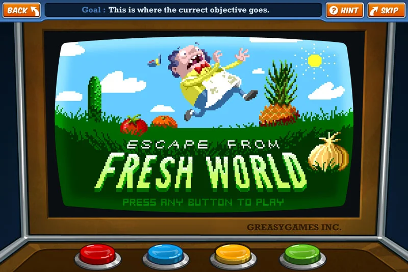
CloudKid is an extraordinary, Emmy-nominated creative agency specializing in animation and interactive children's media. As a member of their team in 2011, I proudly contributed to a number of client projects, primarily a suite of games for the fantastic Fizzy's Lunch Lab.
When Fresh Tilled Soil made coded style guides a standard deliverable, they produced a simple framework to simplify the process of making them. When it came time to open source the project, it needed a name and a logo. Corkscrew was born, and along with it, a fun little duck.





In one of my favorite projects of 2015, I tackled a logo for an up and coming kids brand—and I mean "kids brand" literally; it's made by an 8 year old. Cole Benoit makes and illustrates awesome handmade paper puppets. I helped give his company, Papar Pupit Pepol, some professional polish.